Overview
ChiChi’s Pet Resort is a high-end pet boarding and daycare business. This project focused on redesigning and developing its website to reflect the luxury and professionalism of the resort while making it easier for pet owners to explore services and build trust.
Role
Sole UX/UI designer
Tools
Figma, FigJam, Photoshop, WordPress (Elementor)
Timeline
November 2024 - February 2025 (14 weeks)
Problem
It Started from An Underdesigned Website That Lacked Clarity and Confidence
The original website didn’t represent the premium experience ChiChi’s offers, nor did it provide enough information for pet owners to feel confident booking a service.
Impact
Key Measurable Outcomes

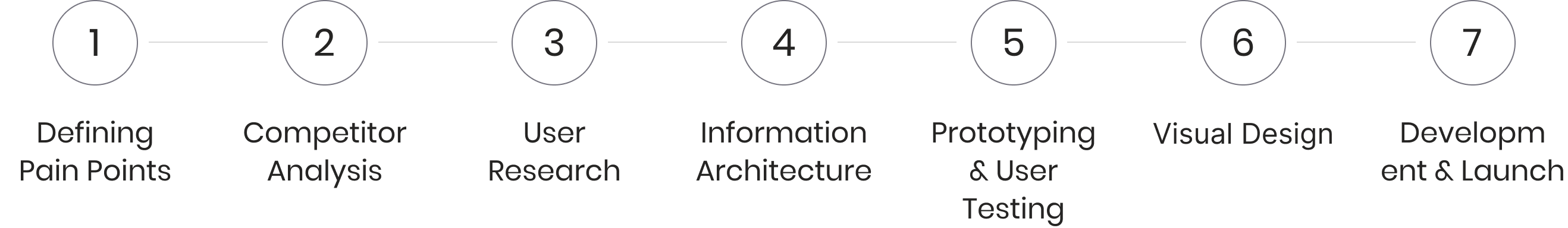
Project Workflow
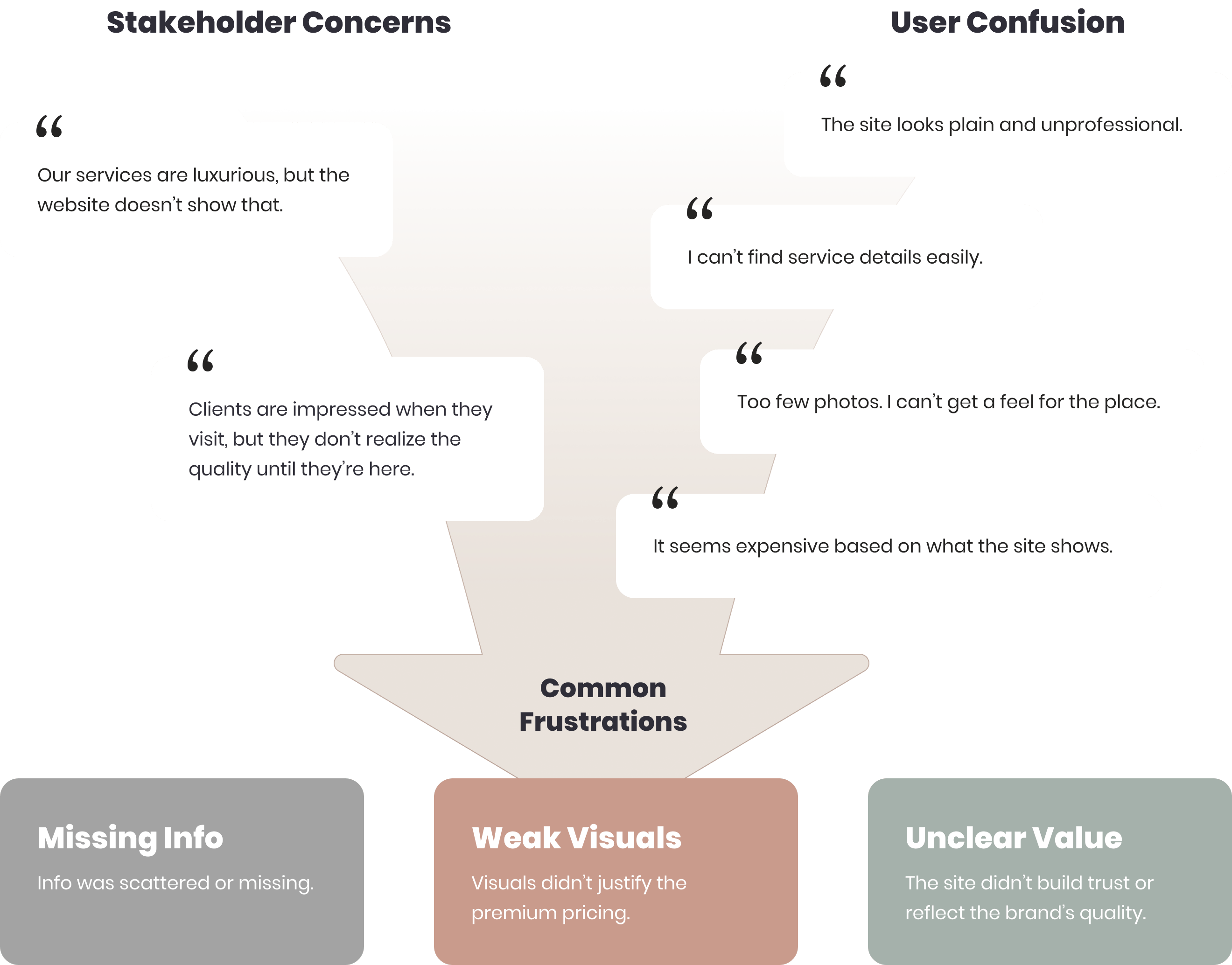
Pain Points
What Wasn’t Working: Insights from Stakeholders and Users
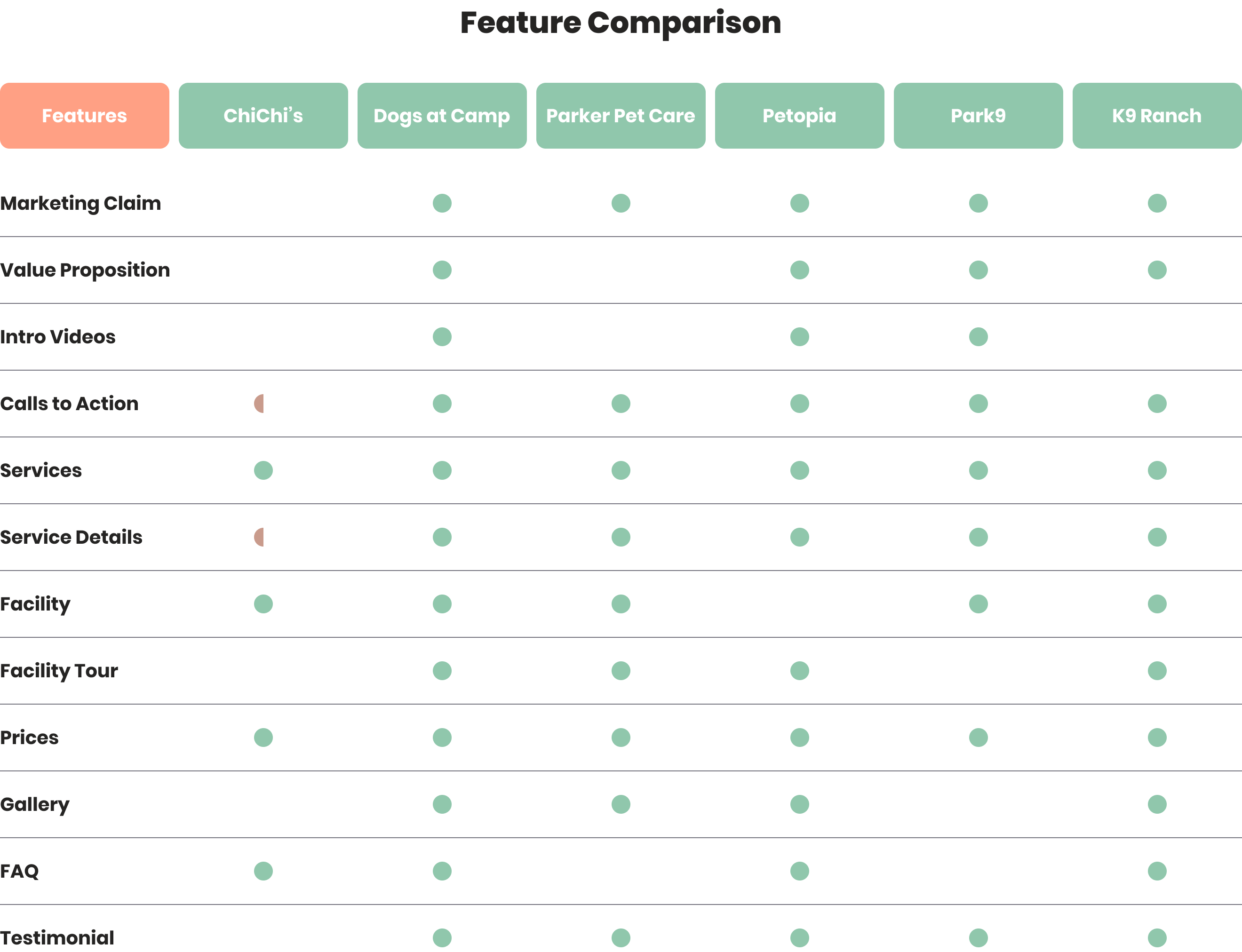
Competitor Analysis
What Competitors Did Better
While ChiChi’s site left users uncertain, competitors built trust through clearer messaging and emotional connection. Their websites often included:
Clear marketing claims
Introduction videos
Service breakdowns
Testimonials
Defined value proposition
Visual galleries
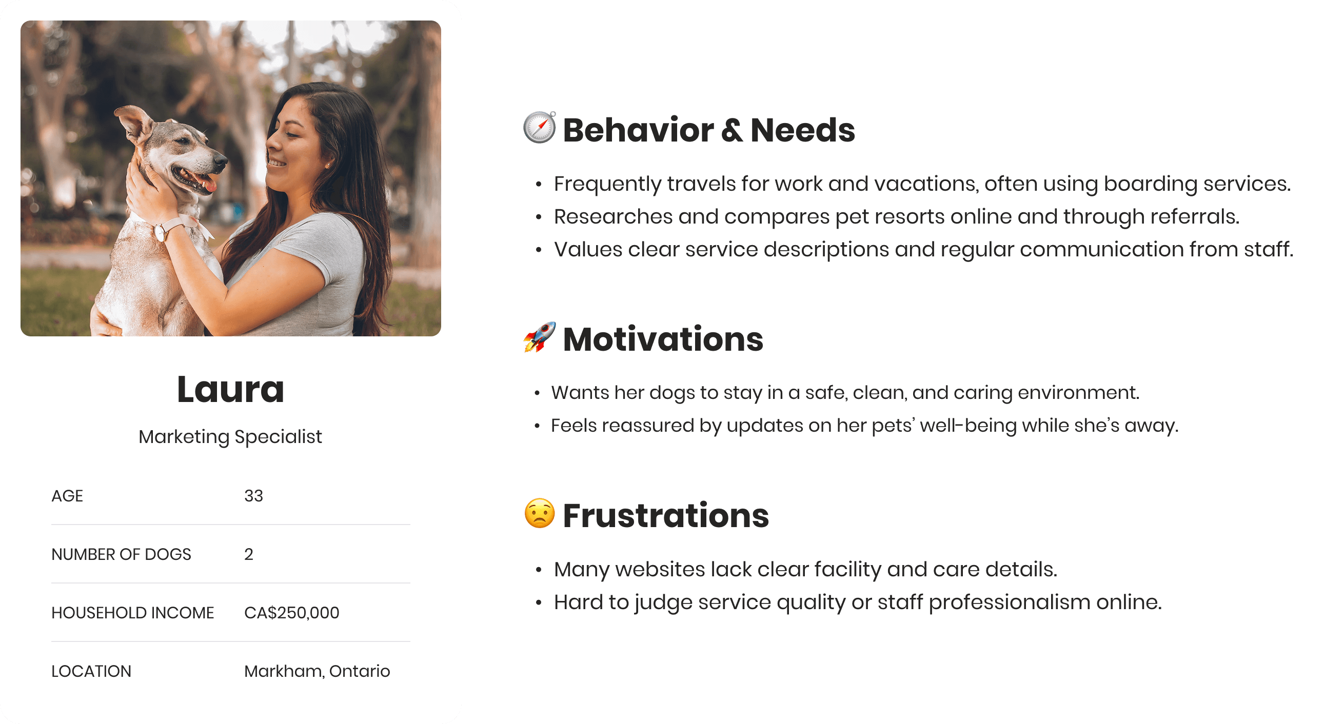
User Research
What Do Customers Look for in a Pet Care Service?
To better understand customer behavior and expectations, I conducted a customer satisfaction survey and developed two personas based on responses and interview insights.
User Survey Highlights
31 customers responded to a survey covering loyalty, behavior, priorities, satisfaction, and demographics.

Personas

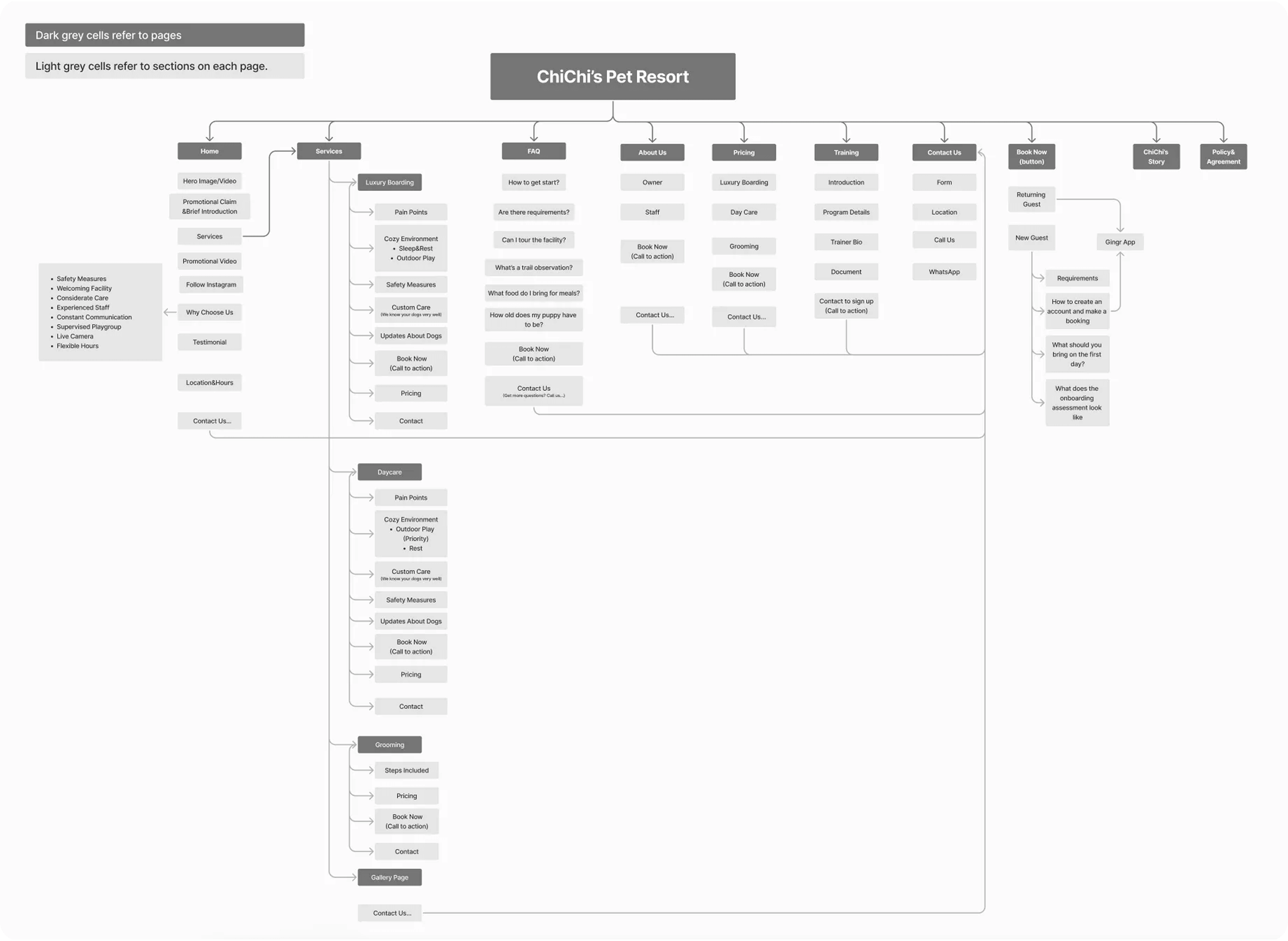
Information Architecture
What Luxurious Service Does the Pet Resort Offer?
Contextual Inquiry
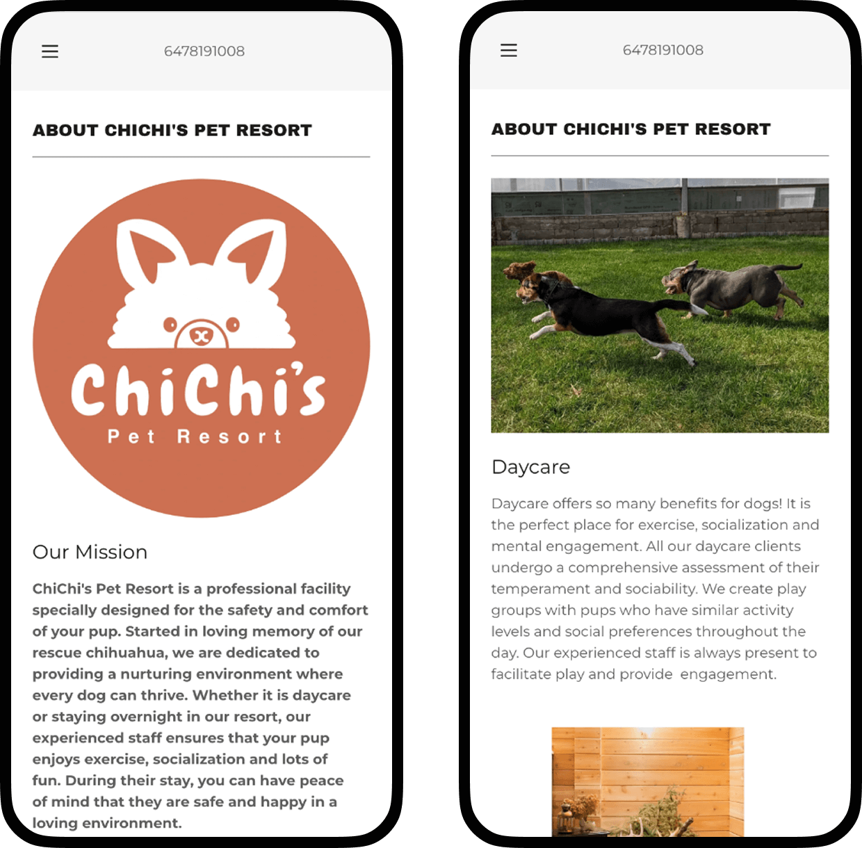
As a former part-time employee at ChiChi’s Pet Resort, I gained firsthand insight into its operations and high service standards—from daily care routines to playgroup organization. This experience allowed me to identify missing service details and enrich the website content during feature mapping and copywriting.
Affinity Mapping
After gathering feature descriptions of the pet resort from previous steps, I categorized and structured them into an affinity map, creating a comprehensive information inventory for feature prioritization and website architecture.
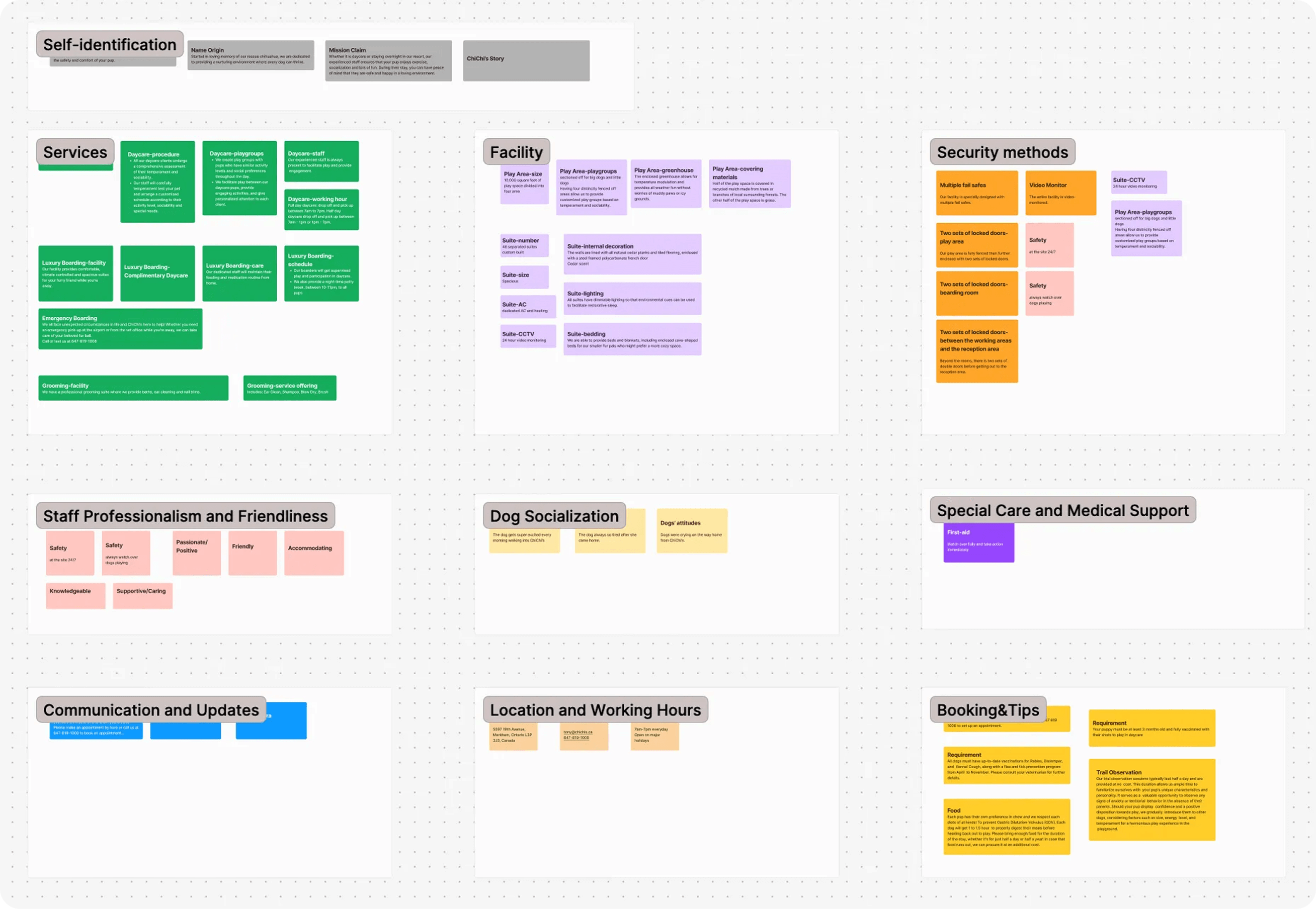
Site Architecture
Balancing both user needs and business goals, I designed the site architecture to guide users through a natural discovery flow:
First impressions (hero section, tagline, visual appeal)
Overview of core services
Detailed highlights that show ChiChi’s unique care, luxury features, and premium standards
Copywriting
Based on the site architecture and information inventory, I wrote the copy, used ChatGPT to refine the content, and then polished it further to ensure it reflected ChiChi’s voice: caring and professional.
Prototyping & User Testing
Validating the Design with User Feedback
During this phase, I sketched ideas, built medium-fidelity wireframes and an interactive prototype, then conducted user testing.
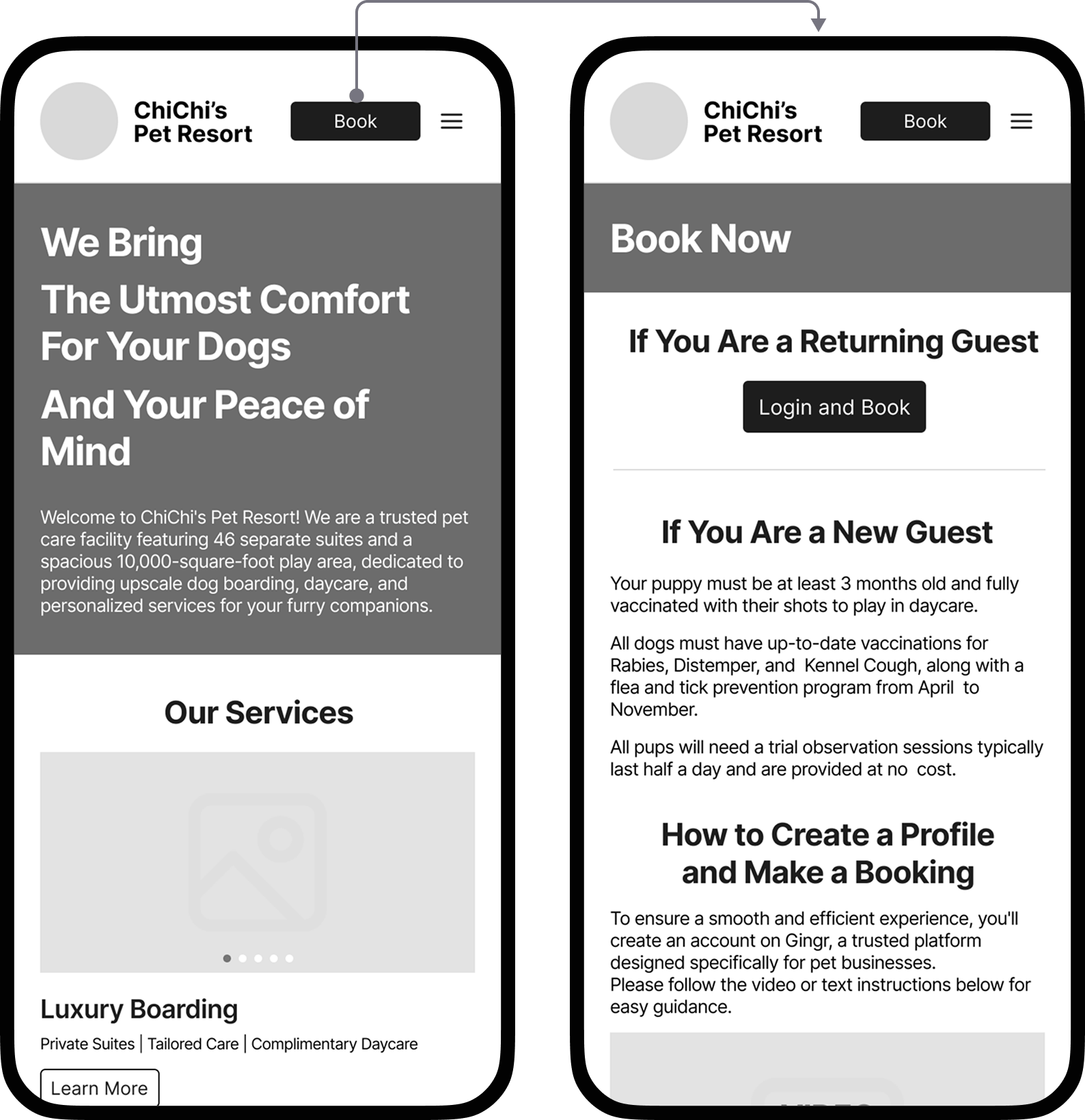
User Feedback: Confusing Call-to-Actions
User testing revealed confusion over two header CTAs: “Booking” (for returning guests) and “Get Started” (for new users). Most participants weren’t sure which to click or what “Get Started” meant.
Simplifying the Call-to-Action
To reduce friction, I replaced both with a single “Book” button that leads to a page combining the direct booking link and a step-by-step guide. This change simplifies navigation while still serving both user types—leading to a cleaner and more intuitive experience.
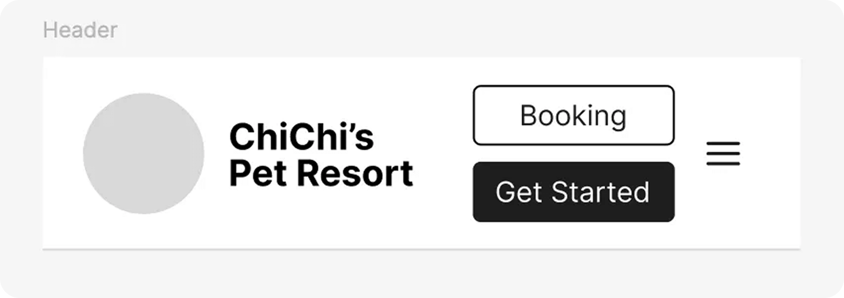
Medium-Fidelity Wireframes
Final Design
From questions to clarity, then to design.
1. Mood Board
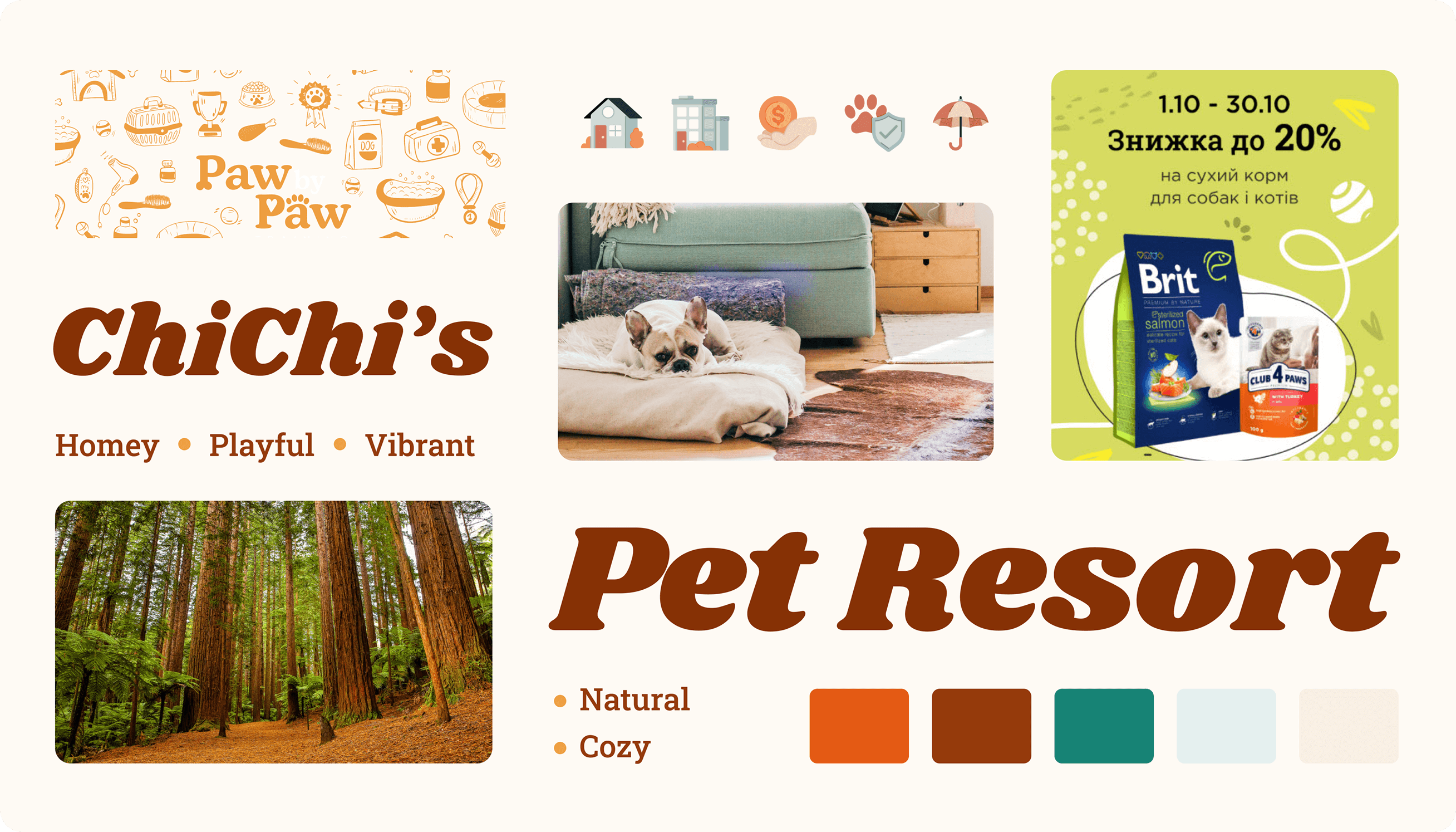
To capture ChiChi’s warm, playful spirit, I built the visual direction around keywords like homey, vibrant, natural, and cozy.
Hand-drawn elements add intimacy
Shrikhand font reinforces a cute, friendly tone
Colors and visuals align with the brand’s inviting, pet-friendly personality
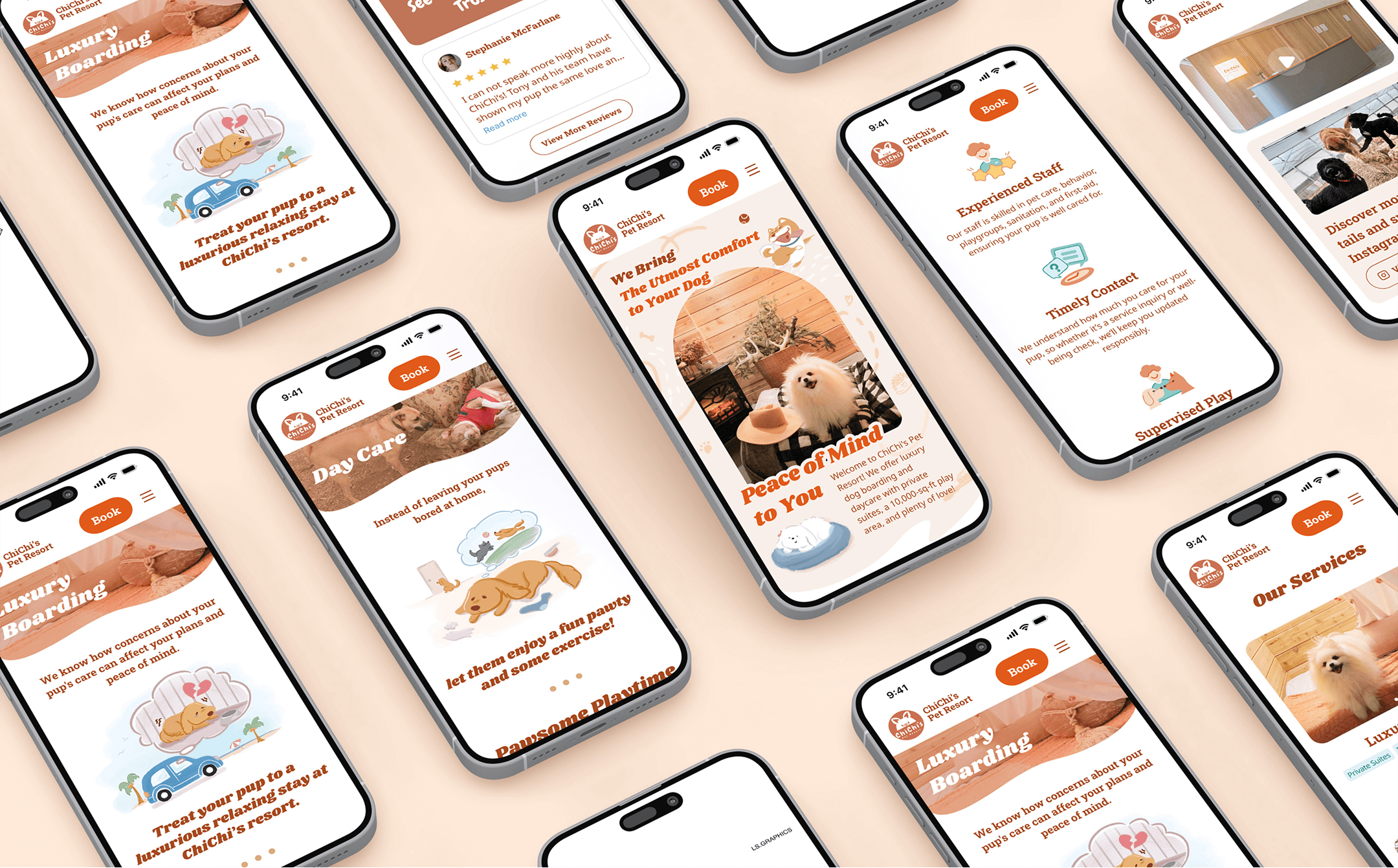
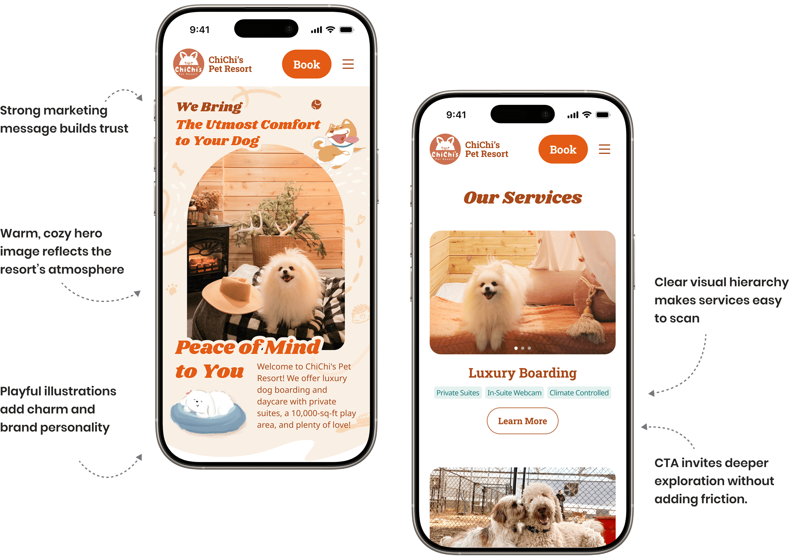
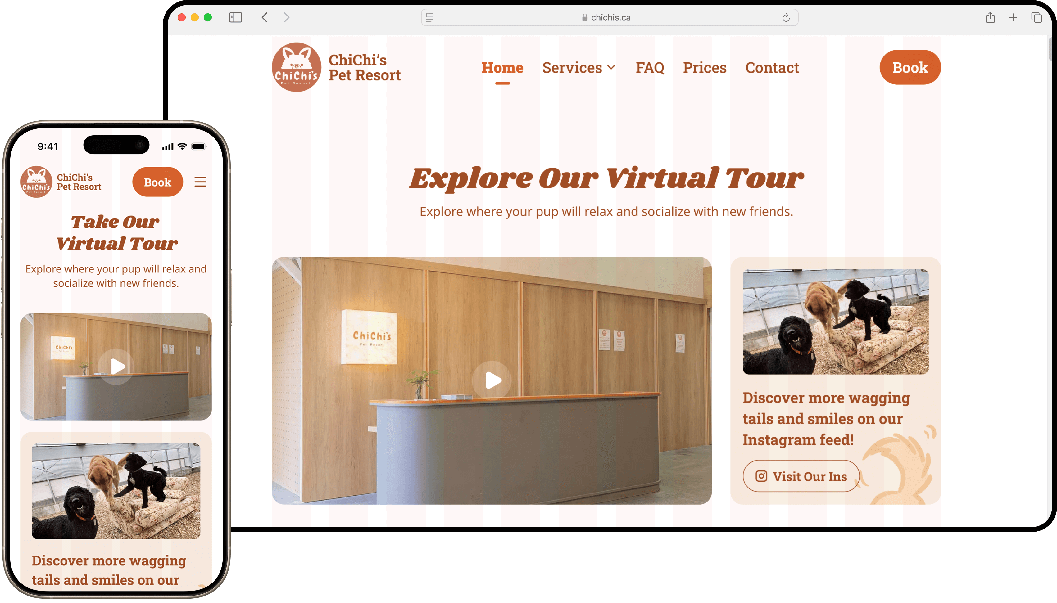
2. Homepage: Designed for Simplicity & Engagement
The homepage guides visitors through key sections—services, facilities, safety, testimonials, and contact—based on user needs identified in research. It’s designed to quickly engage users and lead them toward booking or exploring further with clarity and confidence.

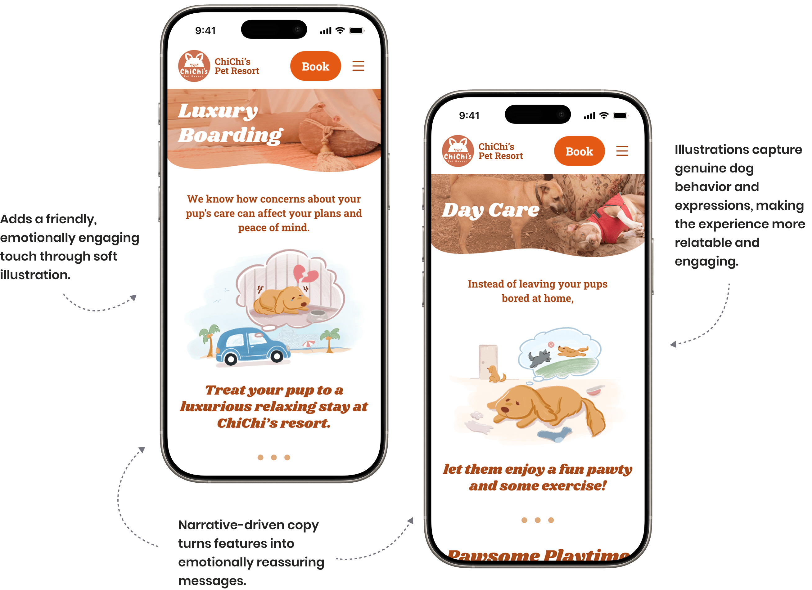
3. Storytelling: Custom Illustrations That Resonate with Users
To connect emotionally with pet owners, I created two illustrated scenarios based on common reasons clients board their dogs—travel and busy work schedules.By combining hand-drawn illustrations with warm, relatable copy, these moments bring the user into real-life situations and reinforce ChiChi’s role as a caring, reliable partner.
4. Responsive Site: Mobile-first layout, consistent experience across devices
With over 70% of users on mobile, I adopted a mobile-first approach.
Built the mobile version first
Adapted to desktop with consistent layouts
Used a grid system to ensure design responsiveness and simplify development
Development
Building the Site: Navigating Technical Challenges
After discussing options with the pet resort owner, we decided to keep the site hosted on GoDaddy but rebuild it in WordPress for a more customized look. To ensure efficient development and save time, we leveraged the Elementor plugin, which significantly boosted productivity. The entire website was successfully built and launched within a month, ahead of the February 16th deadline, all while I balanced my college coursework.
Challenges Overcome
Enhancing Elementor's functionality by applying custom CSS to compensate for missing widgets.
Troubleshooting Elementor-related bugs by communicating with their support team and conducting tests.
Optimizing the hero image by adjusting and testing images and section layouts for the best visual impact.
Resolving slow loading times caused by the synchronous processing of the contact form, using the WP Mail SMTP plugin.
Fixing the automatic deletion of CSS files by implementing a file monitoring plugin and experimenting with Cron Events.
Seamlessly transferring the new website from the temporary domain to the business domain chichis.ca.
Learnings
This project provided a valuable opportunity to refine my UX/UI skills while also gaining hands-on experience in web development. I'm especially proud that, as a team of one, I not only handled the design and development but also effectively communicated with the business owner, created a detailed plan and feasible schedule, stayed on track, and made well-informed decisions.Hearing the positive feedback from customers and seeing the increase in new client numbers after launching the website gave me a strong sense of accomplishment. It reinforced why I love UX/UI design—the ability to create meaningful experiences that drive real impact.