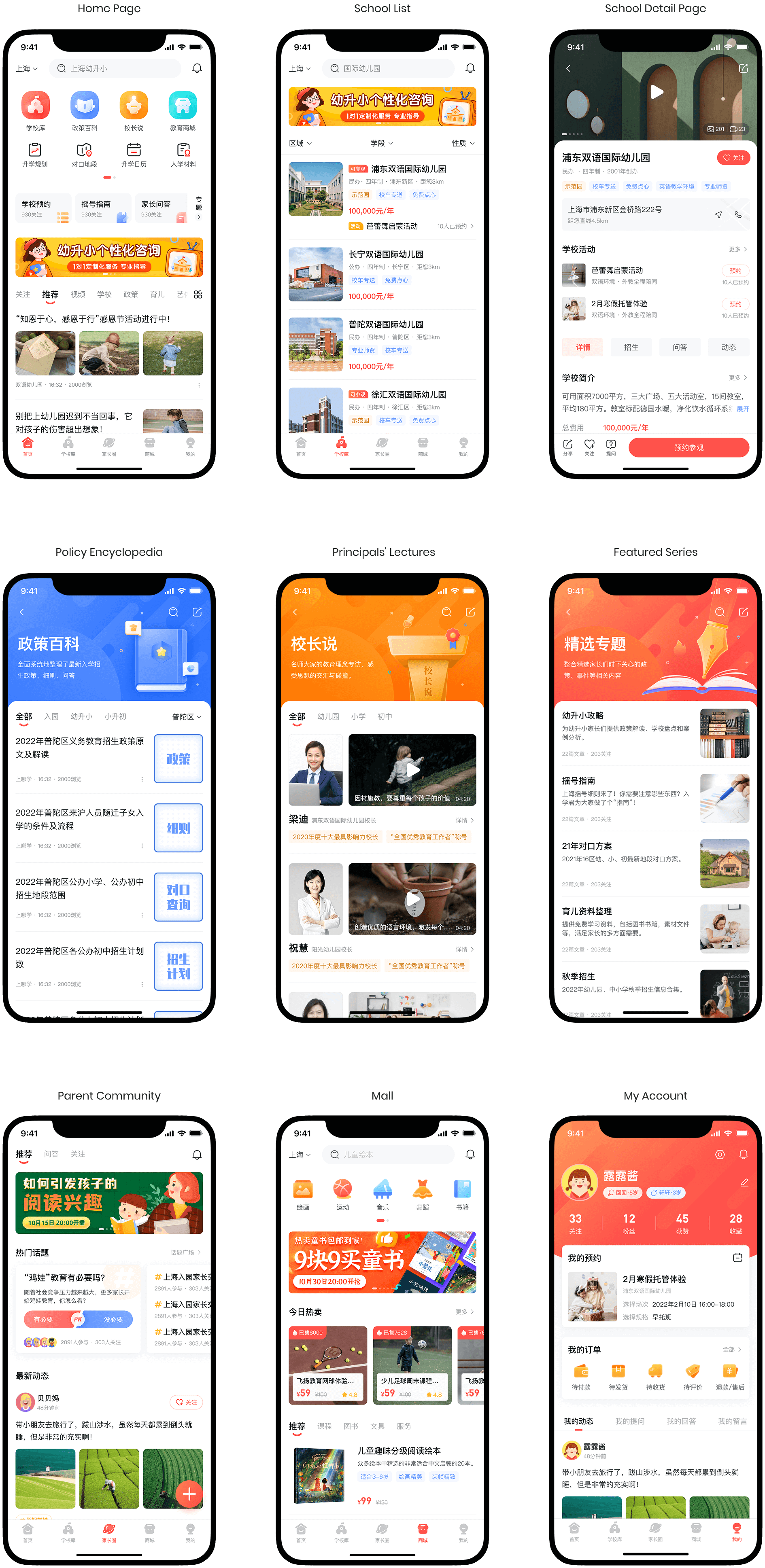
A dynamic collage of multiple mobile screens from the "Where to Study" app, showcasing various pages of the redesigned educational platform. Screens include the policy encyclopedia, homepage, and different informational sections, all featuring content in Chinese.

Overview

Shang Na Xue is an educational app that helps parents in Shanghai navigate school admissions by offering clear policy information, school selection guidance, and parenting support for families with children aged 0–12.

As a sole designer in the startup, I worked closely with the product manager to dive into the app's limitations caused by the rapid business growth and feature expansion, and created design solutions that addressed user confusion and low engagement by optimizing the app’s structure, organizing the information hierarchy, and enhancing visual design.

Role

Sole UX/UI designer

Tools

Sketch, Figma, Photoshop

Timeline

2021-2022

Problem

A Complicated App That Left Parents Lost and Overwhelmed

Parents face overwhelming difficulties navigating the school admission process. The original app lacked clear navigation and presented cluttered information, making it hard for users to find meaningful support.
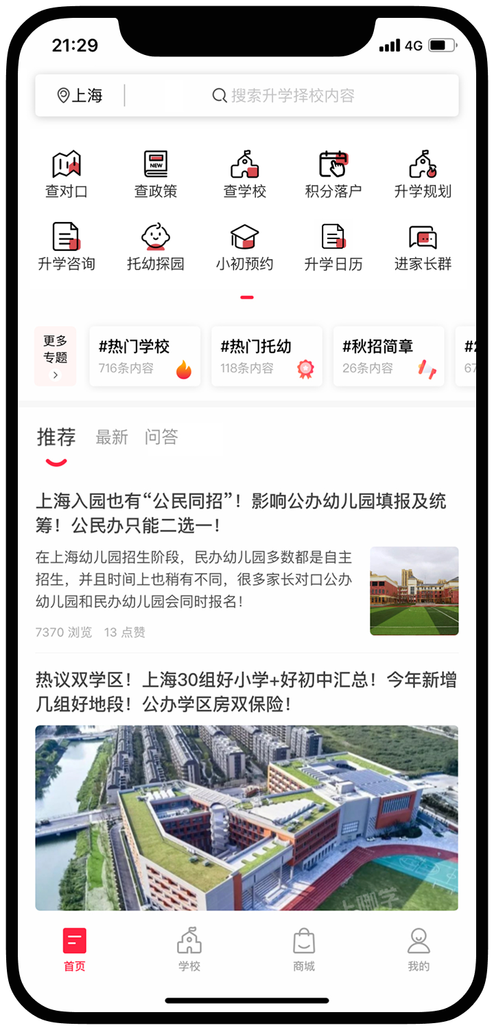
Mobile screen of the original "Where to Study" app homepage before redesign. It shows numerous equally emphasized entry points for functions like checking school zoning, policies, and school archives, along with news articles in Chinese, indicating a cluttered interface.

Solution

A Streamlined Experience That Connects Parents with the Support They Need

We delivered a streamlined, informative, and easy-to-navigate experience—empowering parents to find the guidance they’re looking for while positioning the platform as a trusted, engaging service built for long-term growth.

Mobile screen of the redesigned "Where to Study" app homepage. It features a cleaner layout with categorized entry points for 'School Library', 'Policy Encyclopedia', 'Principal's Say', and 'Education Mall', along with sections for 'Personalized Consultation' and various recommended articles and topics, presenting information more clearly than the original.

Impact

Key Measurable Outcomes

Key Measurable Outcomes of the "Where to Study" app redesign. Metrics shown are: Average Engagement Time of School Detail Page increased from 13s to 37s, Monthly school activity bookings increased by +100%, and Monthly school visit bookings increased by +84%.

Project Workflow

Diagram illustrating the 7-step project workflow for the "Where to Study" app redesign. Steps include: 1. Stakeholder Interviews, 2. Heuristic Analysis, 3. User Research, 4. Information Architecture, 5. Prototyping & User Testing, 6. Visual Design, and 7. Developer Handoff.

Stakeholder Interview

Listening to the Business Vision

At the beginning of the project, the product manager and I met with our boss to understand his vision for the app optimization. The key takeaways were:

Three key insights from stakeholder interviews for the "Where to Study" app. They are: 'Low Retention & Engagement', describing the app's struggle to maintain user volume; 'Unclear Value Proposition', noting the platform's core strengths are not clearly communicated; and 'Neglect of Profitable Opportunities', suggesting a need to focus on enriching partner school showcases and strengthening the e-commerce section.

Heuristic Analysis

Challenges We Faced

1. Rapid Business Growth Led to a Cluttered Home Page

Driven by over four years of experience in educational consulting, the company was eager to showcase its expertise through new tools and services. During the early app development, features were added quickly and continuously. As a result, the home page became overloaded with entry points—many of which were equally emphasized—making it difficult to prioritize core features or draw attention to the most valuable ones.
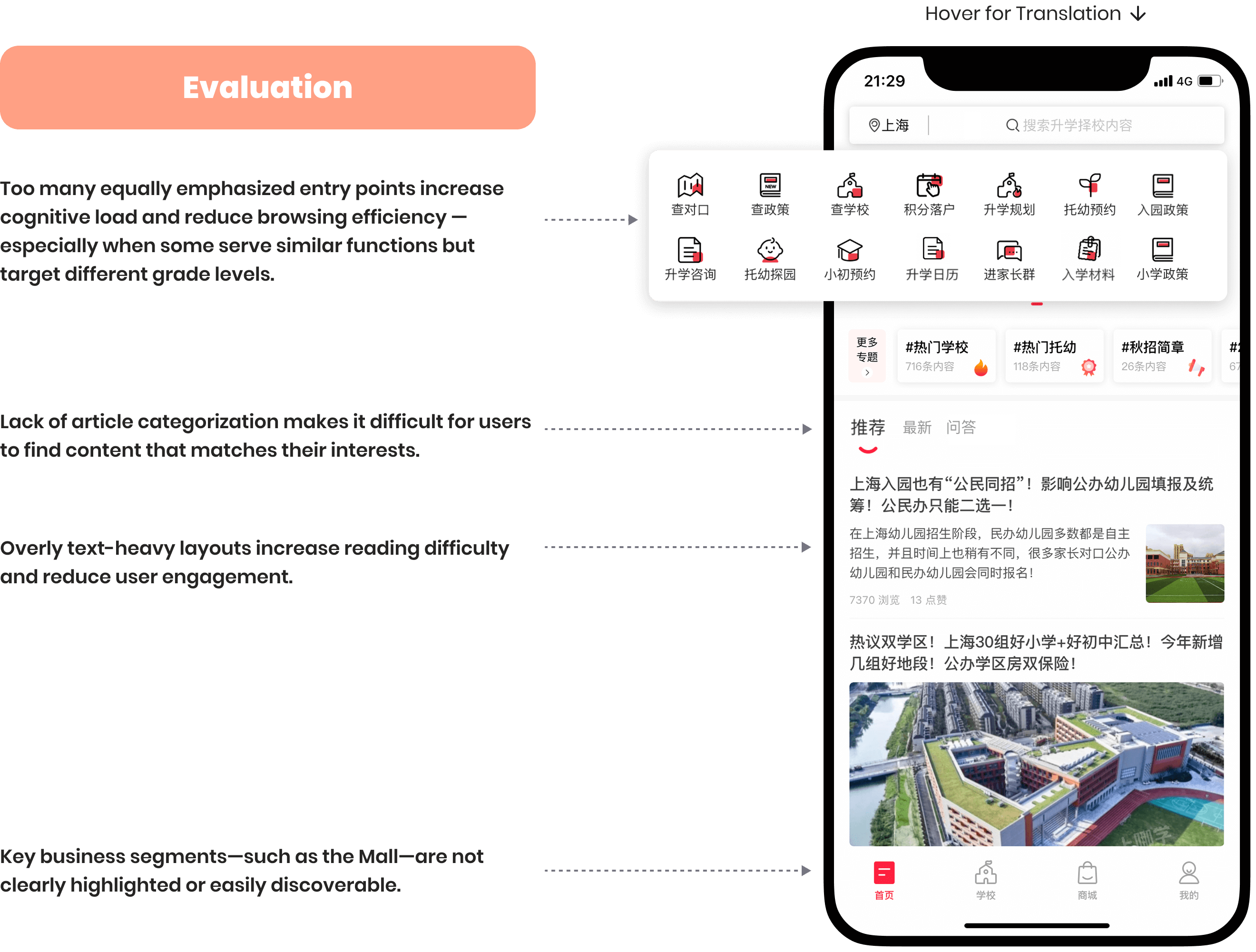
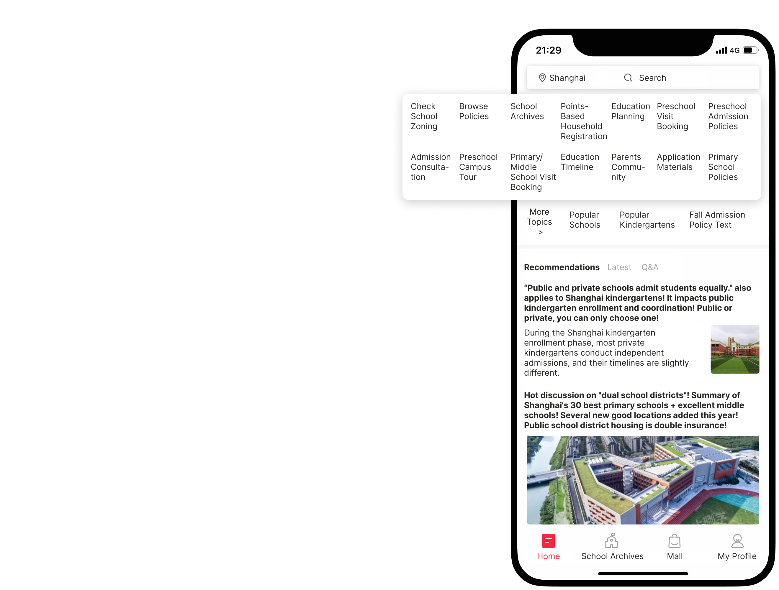
Heuristic Analysis of the original "Where to Study" app homepage. The left side details evaluation points such as: too many equally emphasized entry points, lack of article categorization, overly text-heavy layouts, and unclear business segment highlighting. The right side provides a translation of the homepage elements, including entry points for school zoning, policies, and various article sections.The translated home screen of the Shang Na Xue ("Where to Study") mobile app. The screen features a grid of icon buttons for various services, including "Check School Zoning," "Primary/Middle School Visit Booking," and "Parents Community". Below the grid is a "Recommendations" section with articles about Shanghai school admission policies. A navigation bar at the bottom has icons for "Home," "School Archives," "Mall," and "My Profile".

2. Limited Cross-Team Collaboration Resulted in Incomplete School Information

Much of the school-related content was maintained by the social media editorial team, who regularly published news and updates through blog articles. However, this valuable information was never systematically integrated into the school detail pages within the app. Without a proper content pipeline between teams, many pages remained incomplete, outdated, or inconsistent in depth.
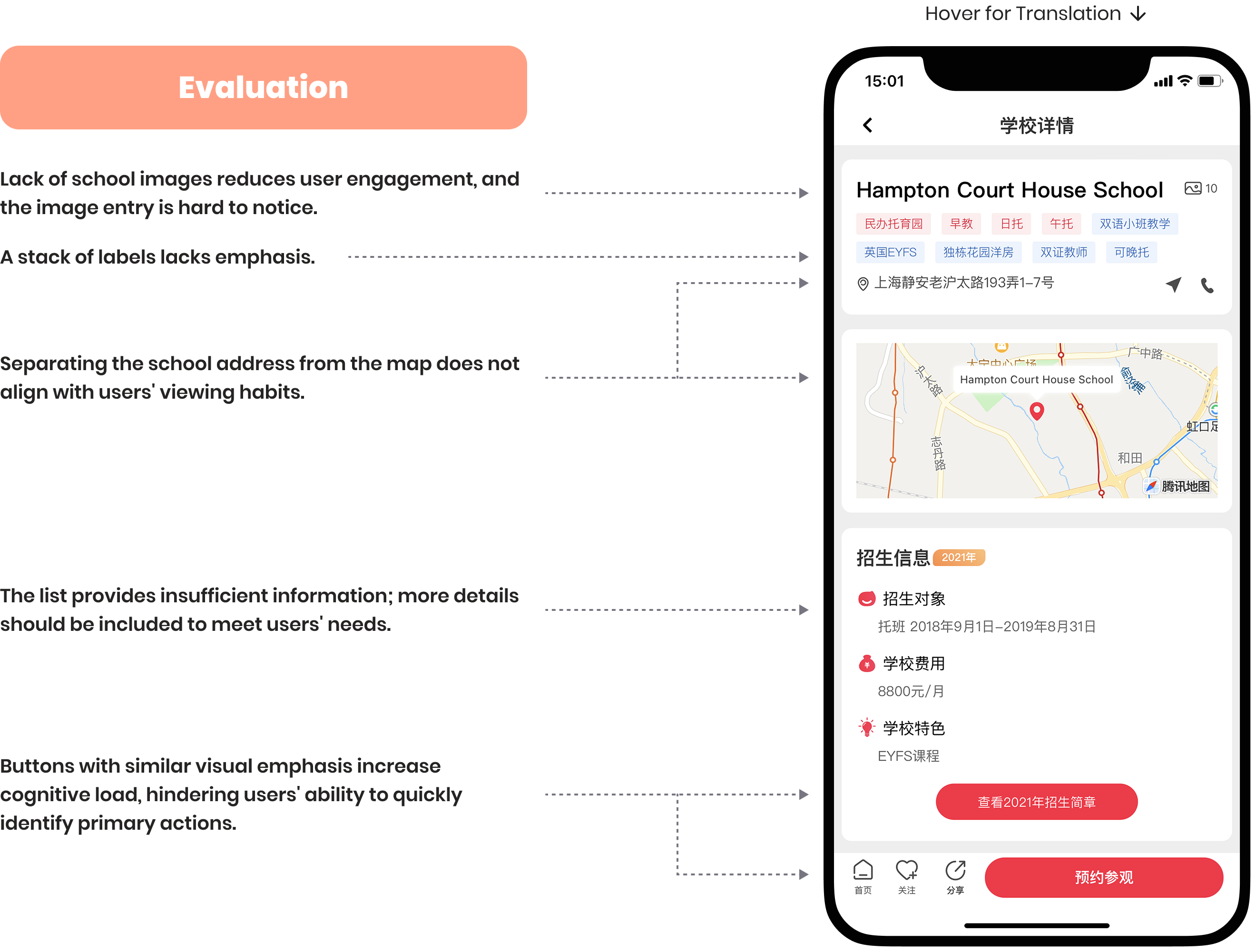
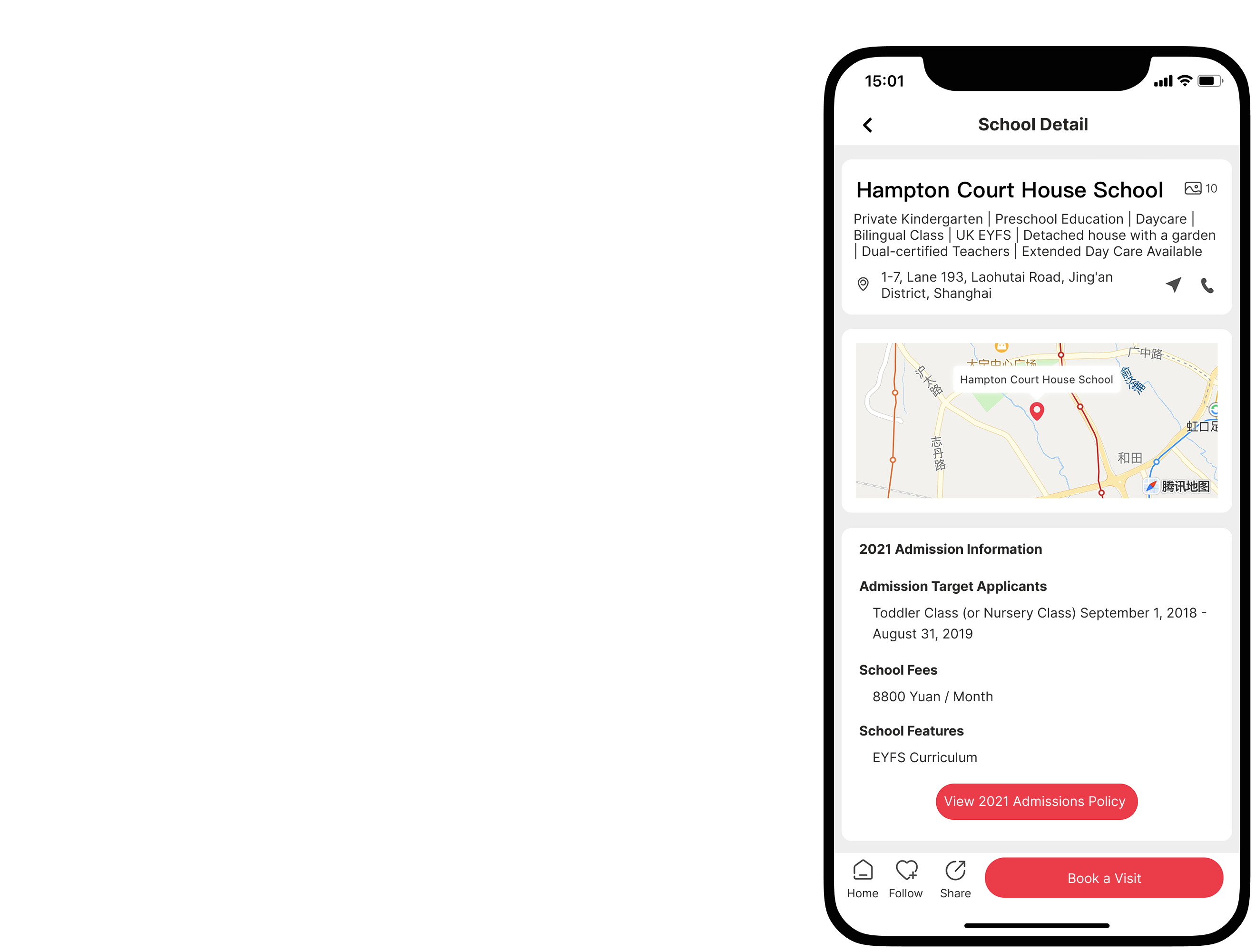
Heuristic Analysis of the original "Where to Study" app's School Detail Page. The left side lists evaluation points: lack of school images, un-emphasized image entry, separation of address from map, excessive map space, and insufficient information in the list. The right side translates features and sections of the school detail page, including feature labels, location and contact, map, admission information, and buttons to view documents or book a school tour.The translated "School Detail" page from the Shang Na Xue app. The page is for the "Hampton Court House School" and displays its address, a map of its location, and key details like being a private kindergarten. An "Admission Information" section lists target applicants, school fees of "8800 Yuan / Month," and curriculum features. A large red button at the bottom of the screen allows users to "Book a Visit".

3. Inconsistent Design Style and Poor Asset Management

The original app lacked a unified design system. Common issues included inconsistent use of colors, varying corner radii, generic icons, and a confusing font hierarchy. These inconsistencies negatively impacted user trust and visual clarity. On top of that, disorganized design files and a lack of documentation made it difficult to onboard, audit, or extend the existing design efficiently.

User Interviews

Listening to Our Users

With a basic understanding of the current UX issues, the product manager and I conducted user interviews to gain deeper insights, build user personas, and define core pain points. We recruited 10 participants from a user group chat, including both new and long-term users of the app.
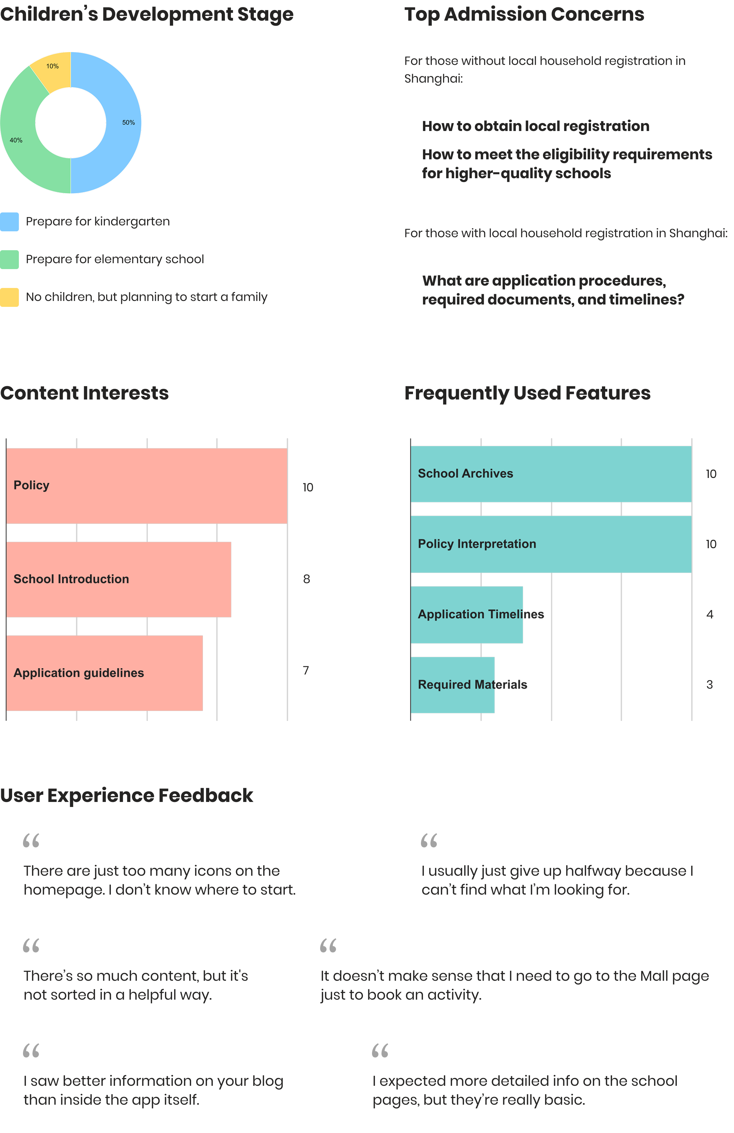
Summary of user insights for the "Where to Study" app. Sections include: 'Children's Development Stage' (showing percentages for kindergarten and elementary prep), 'Top Admission Concerns' (for both local and non-local household registrations), 'Content Interests' (policy, school intro, guidelines), 'Frequently Used Features' (school archives, policy interpretation, etc.), and 'User Experience Feedback' (quotes on too many icons, difficulty finding content, text-heavy layout, and basic school pages).

User Pain Points

What Are Users’ Complaints?

Two identified pain points for the "Where to Study" app: 'Cluttered Navigation' indicating too many confusing entry points, and 'Lack Structured Information' noting the difficulty for users to rely on the app due to disorganized and incomplete content.

Design Goals

Delivering a clearer and more informative user experience

by optimizing the app’s structure, information hierarchy, and visual design consistency.

Solution 1

Streamlining Navigation for an Effortless Experience

The homepage's redesign focused on enhancing navigation efficiency and reducing cognitive load. This was achieved by improving feature prioritization, logical grouping, and implementing a clear content categorization system to deliver a strong first impression.
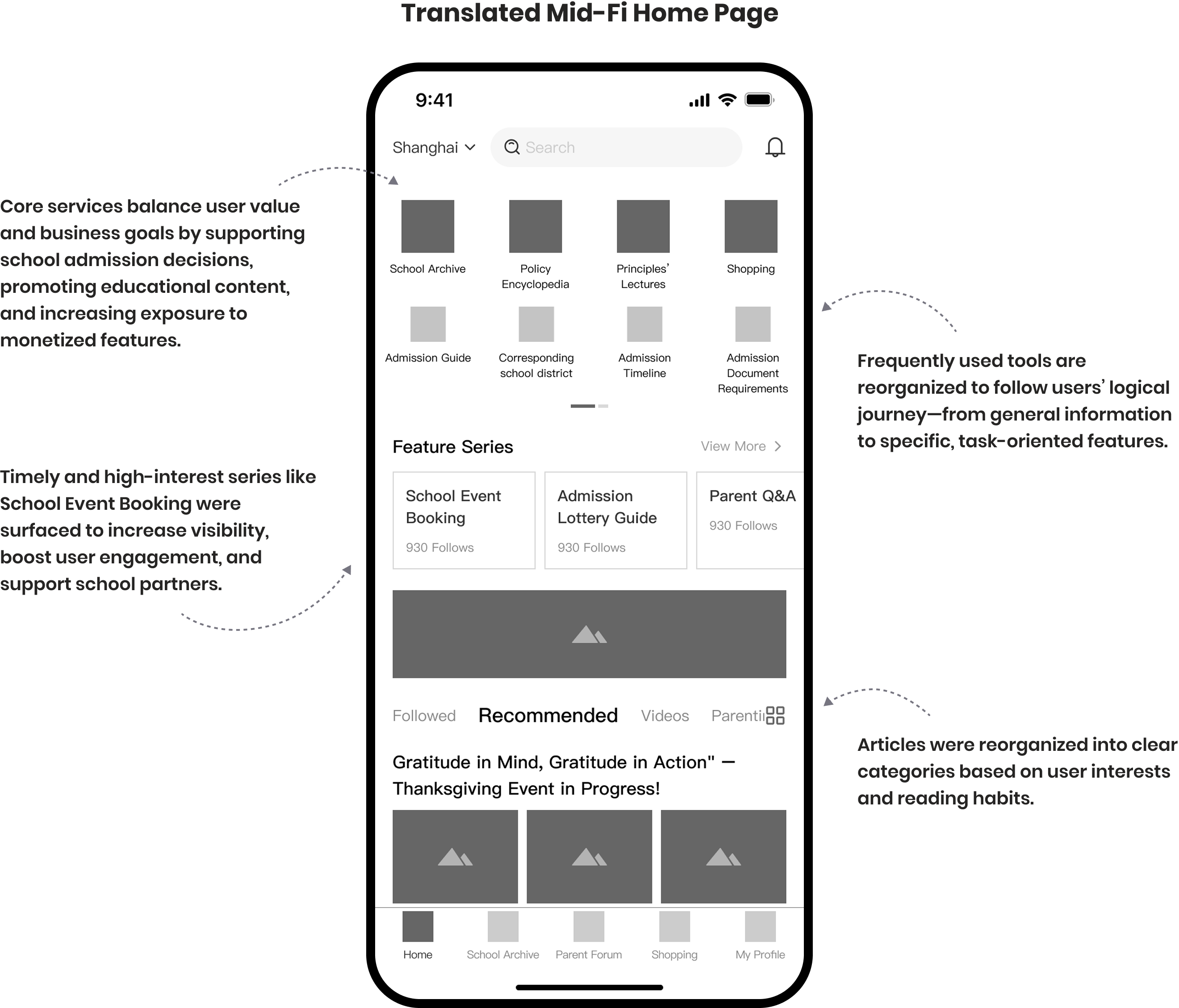
Translated mid-fidelity mockup of the "Where to Study" app homepage, illustrating Solution 1 for enhanced navigation efficiency. Annotations explain how core services balance user and business goals, frequently used tools are reorganized for a logical user journey, and articles are categorized for clearer user interests and reading habits.
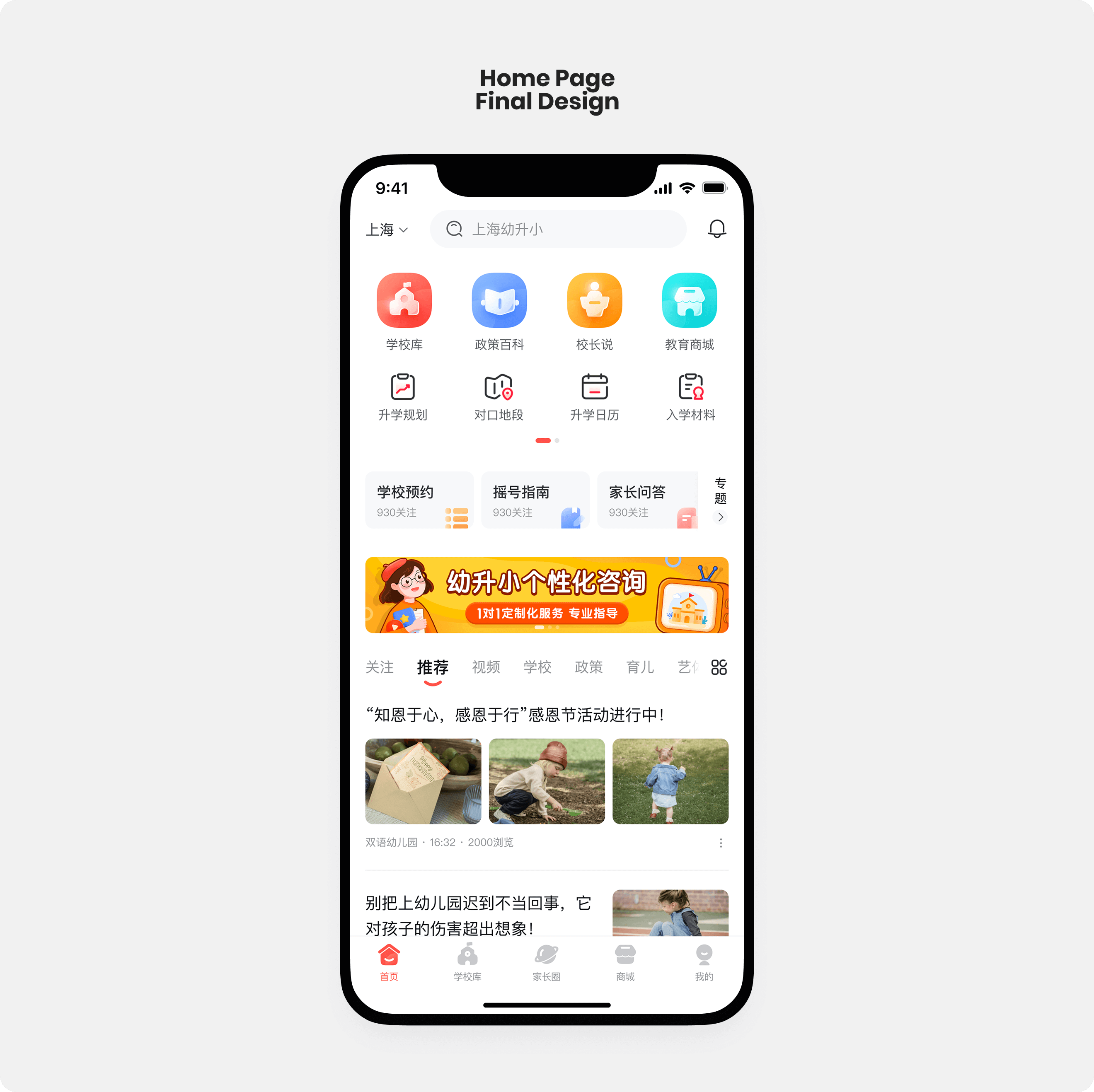
High-fidelity final design of the "Where to Study" app homepage, demonstrating Solution 1's improvements. It features a streamlined layout with clear, intuitive content categorization and prioritized features like 'School Library', 'Policy Encyclopedia', 'Principal's Say', and 'Education Mall', alongside recommended articles and event listings in Chinese.

Solution 2

Richer Profiles, Clearer Information

The school detail page redesign aimed at providing users with enriched school profiles and a streamlined information hierarchy to improve content clarity and support informed decision-making.

1. Collecting and categorizing data fields through collaboration

To improve the depth and consistency of school profile content, I first collected and organized the existing data fields provided by the editorial team. I then conducted follow-up discussions to better understand how they collect, verify, and manage this information.Based on the discussion, all fields were grouped into three main categories:
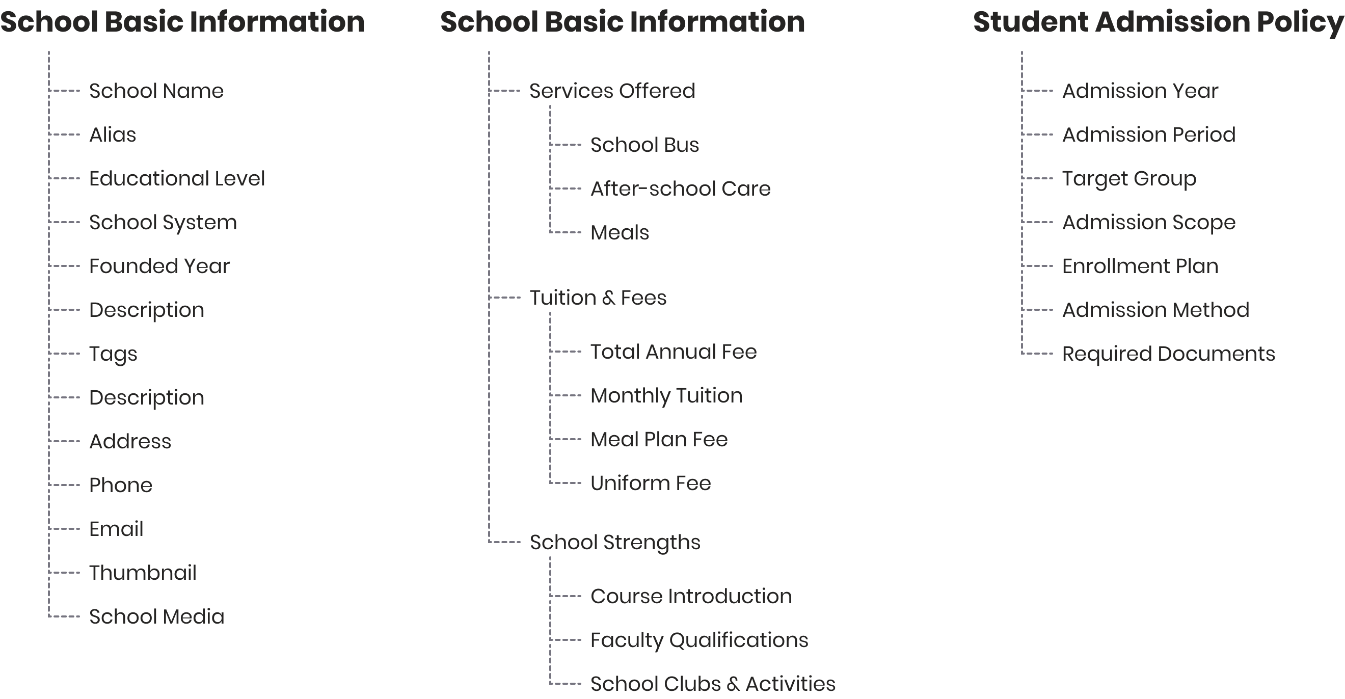
Diagram showing collected and categorized data fields for school information, grouped into three main categories: 'School Basic Information' (including name, level, address, contact), 'School Basic Information' (for services, tuition, strengths), and 'Student Admission Policy' (admission year, period, target group, etc.).

2. Redesigning the CMS editing panel

The CMS editing panel was then redesigned to reflect this new structure, aligning with the editorial team’s workflow to ensure smoother content input and management.
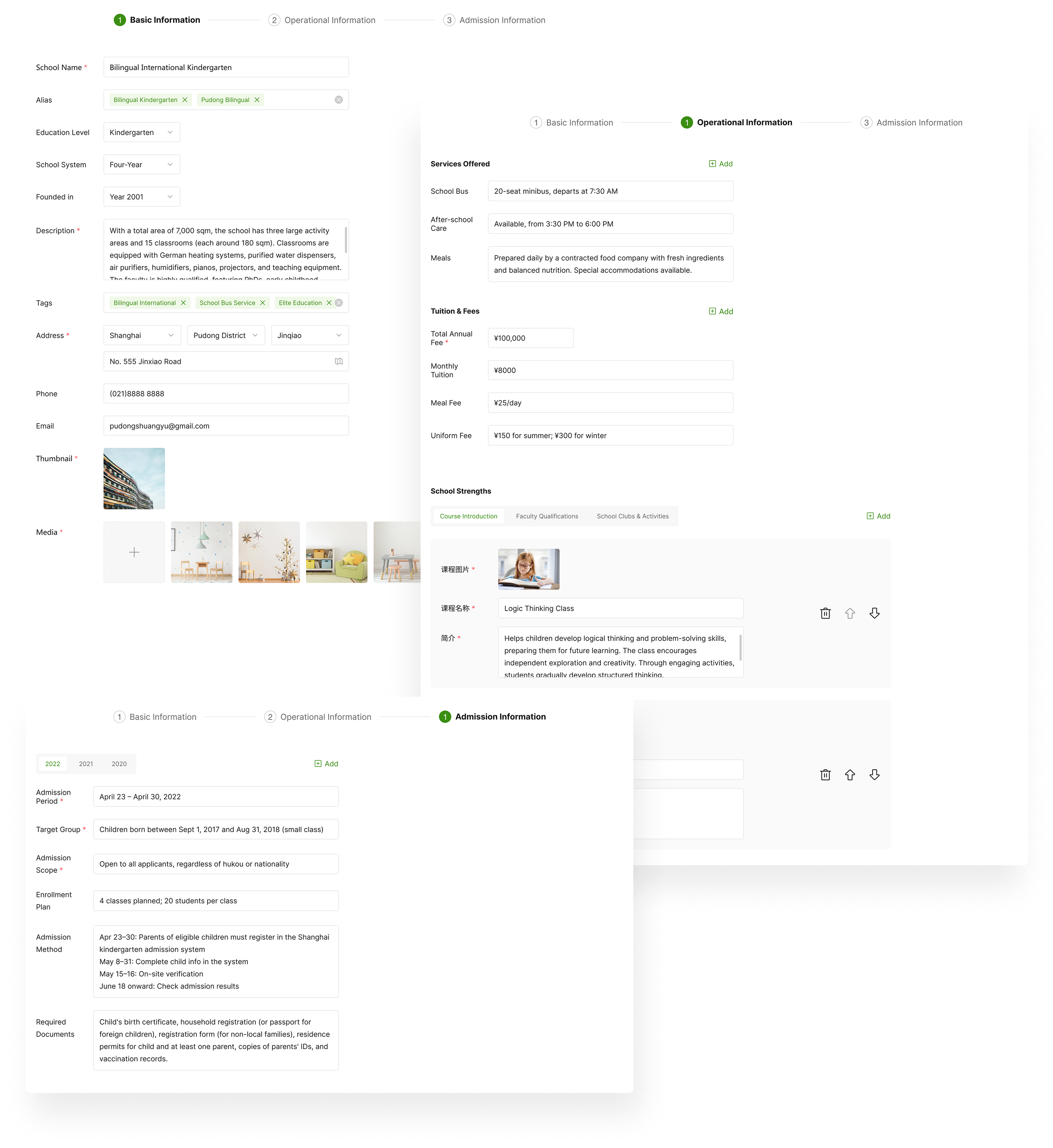
Screenshots demonstrating the redesigned CMS editing panel for the "Where to Study" app. The panels are organized into 'Basic Information', 'Operational Information', and 'Admission Information', allowing for comprehensive data entry for schools, including services, tuition, and admission policies.

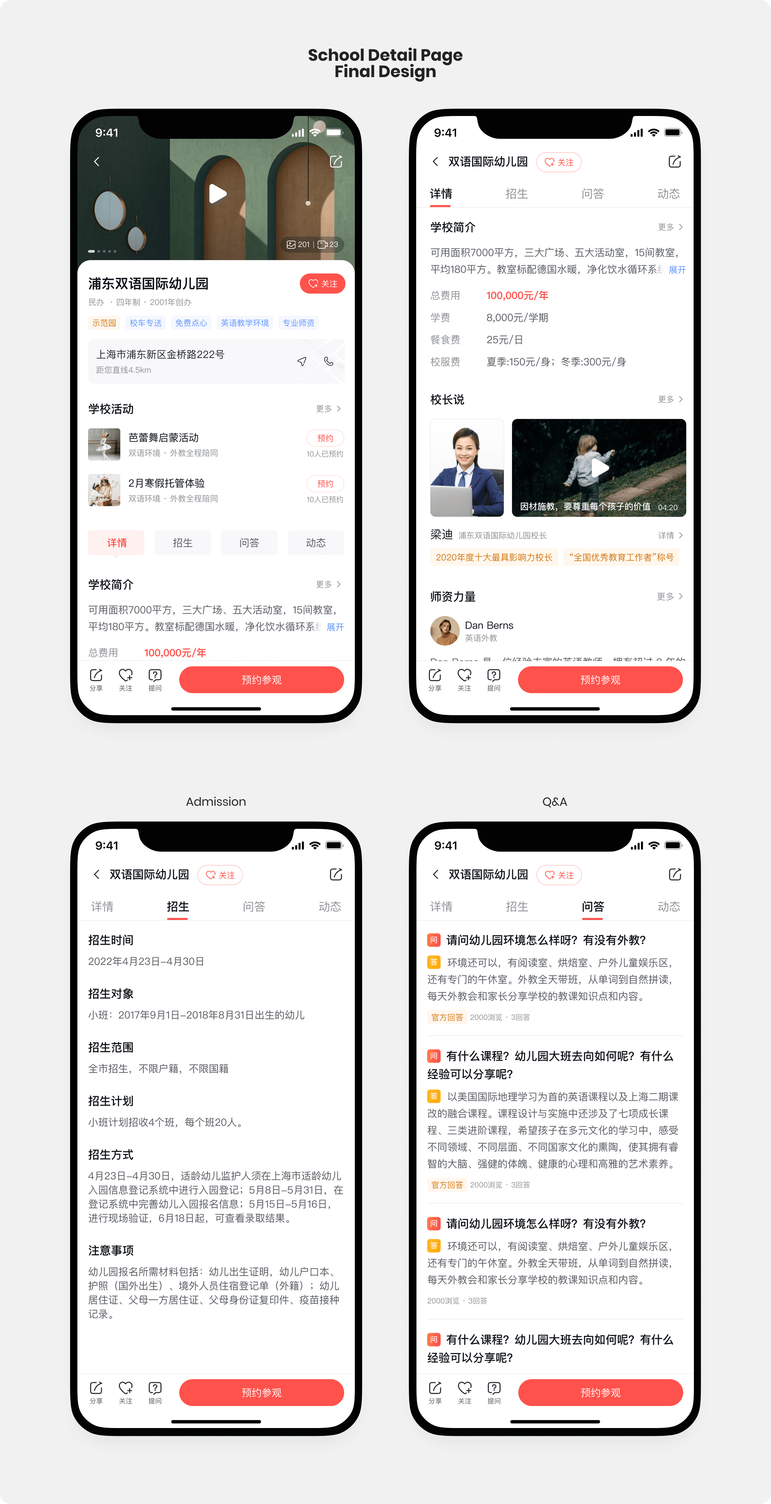
3. Refining the Information Hierarchy of the School Detail Page

To align with users’ reading patterns and their priorities for key information, we carefully restructured the information hierarchy—making content easier to navigate, scan, and absorb.

Mid-fidelity wireframes showing the refined information hierarchy of the "Where to Study" app's School Detail Page. The wireframes illustrate how social media content is captured, key school strengths are highlighted, and a dedicated section for school activities is introduced to increase visibility, improving content organization and user engagement.
High-fidelity mobile mockups of the "Where to Study" app's School Detail Page. The top-left screen shows the school's general information including address, activities, and a brief introduction. The top-right screen displays detailed information such as fees, a principal's introduction, and faculty qualifications. The bottom-left screen focuses on admission details like dates, target applicants, and required documents. The bottom-right screen presents a Q&A section for the school.

Solution 3

Establishing Trust through Visual Consistency

I created a design system and component library that not only enhanced visual consistency but also increased the design speed and improved communication with developers.

I began by collecting and reviewing all design files—from the earliest versions to the most recent. Then, I selected screens and components that matched the current live version and consolidated them into a unified working file.

Using this foundation, I standardized the typographic hierarchy, defining clear levels from Heading 1 down to label text. I refined the color system by selecting main colors based on previously used shades and reducing the number of secondary colors to minimize visual clutter and inconsistency. In addition, I defined spatial guidelines, including consistent whitespace, corner radii, and button sizes.
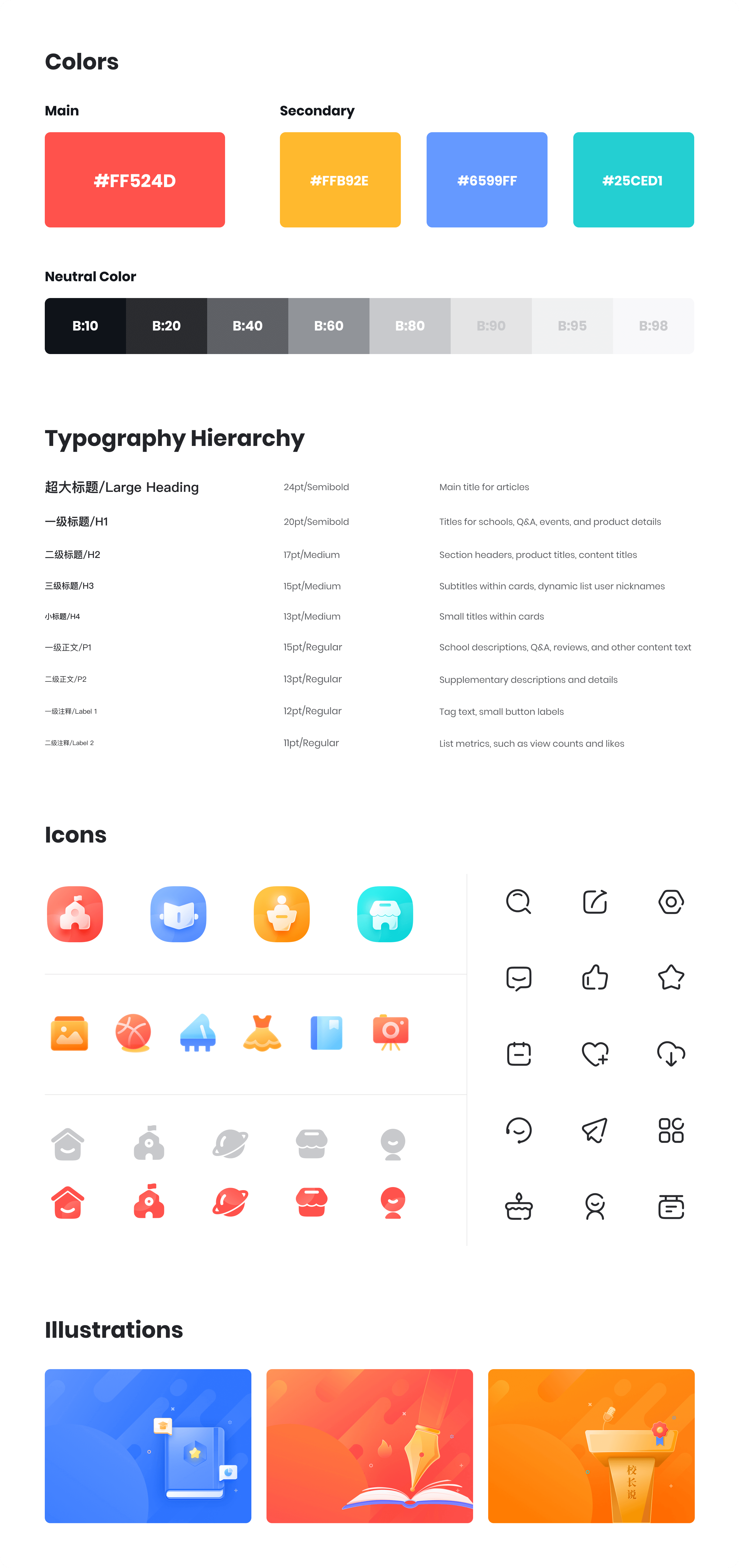
Style Guide for the "Where to Study" app, detailing design elements. It includes the main and secondary color palettes (orange, yellow, blue, teal, and a neutral gray scale), a typography hierarchy with different font sizes and weights, a collection of app icons in various styles and colors, and three distinct illustrations with a bright, educational theme.

Final Design

A grid of high-fidelity mobile screens showcasing the final design of the "Where to Study" app. Pages displayed include the Home Page, School Detail pages, Policy Encyclopedia, Principal's Lectures, Featured Series, Parent Community, Education Mall, and My Account, all featuring Chinese content with clear and vibrant UI.

Learnings

I truly appreciate the opportunity this project provided to engage closely with users and learn from their experiences. Most importantly, it helped me understand the product designer’s role in balancing user needs with business objectives. While I’m still learning to see the bigger picture during the design process, this project has been a strong starting point. It has sharpened my skills and pushed me toward becoming a more mature UX designer.

Other Projects

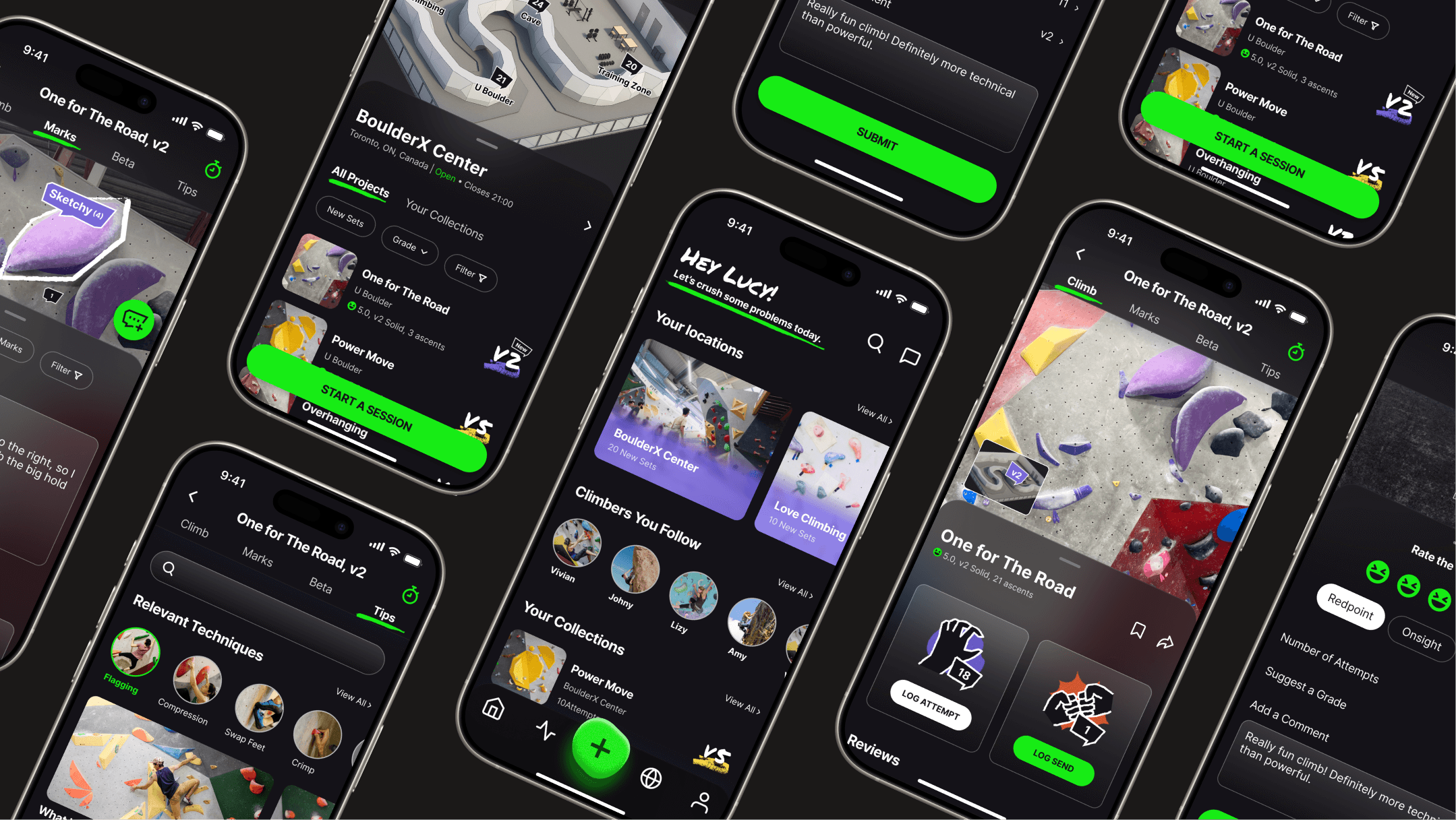
A dynamic collage of multiple mobile screens from the WALLZ climbing app, showcasing its dark-themed UI and key features. Screens visible include the homepage, a gym detail page, a project detail page ('One For The Road'), and an in-climb tracking interface with beta recording and submission options.

WALLZ Bouldering App

A passion project: Connecting Toronto's climbers with tailored guidance and community learning.

Learn More

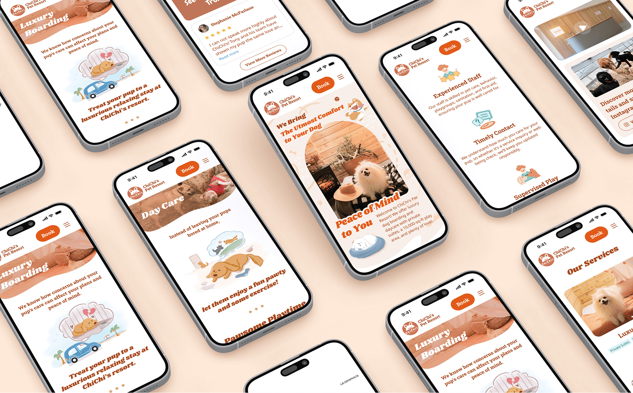
Multiple mobile screens displaying the ChiChi's Pet Resort website redesign. Various pages are shown, including Luxury Boarding, Day Care, the homepage, and sections highlighting experienced staff, timely contact, supervised play, and other services, all featuring dog-friendly imagery.

ChiChi's Pet Resort Website

Elevating a luxury pet resort's digital presence to build trust and simplify service exploration.

Learn More