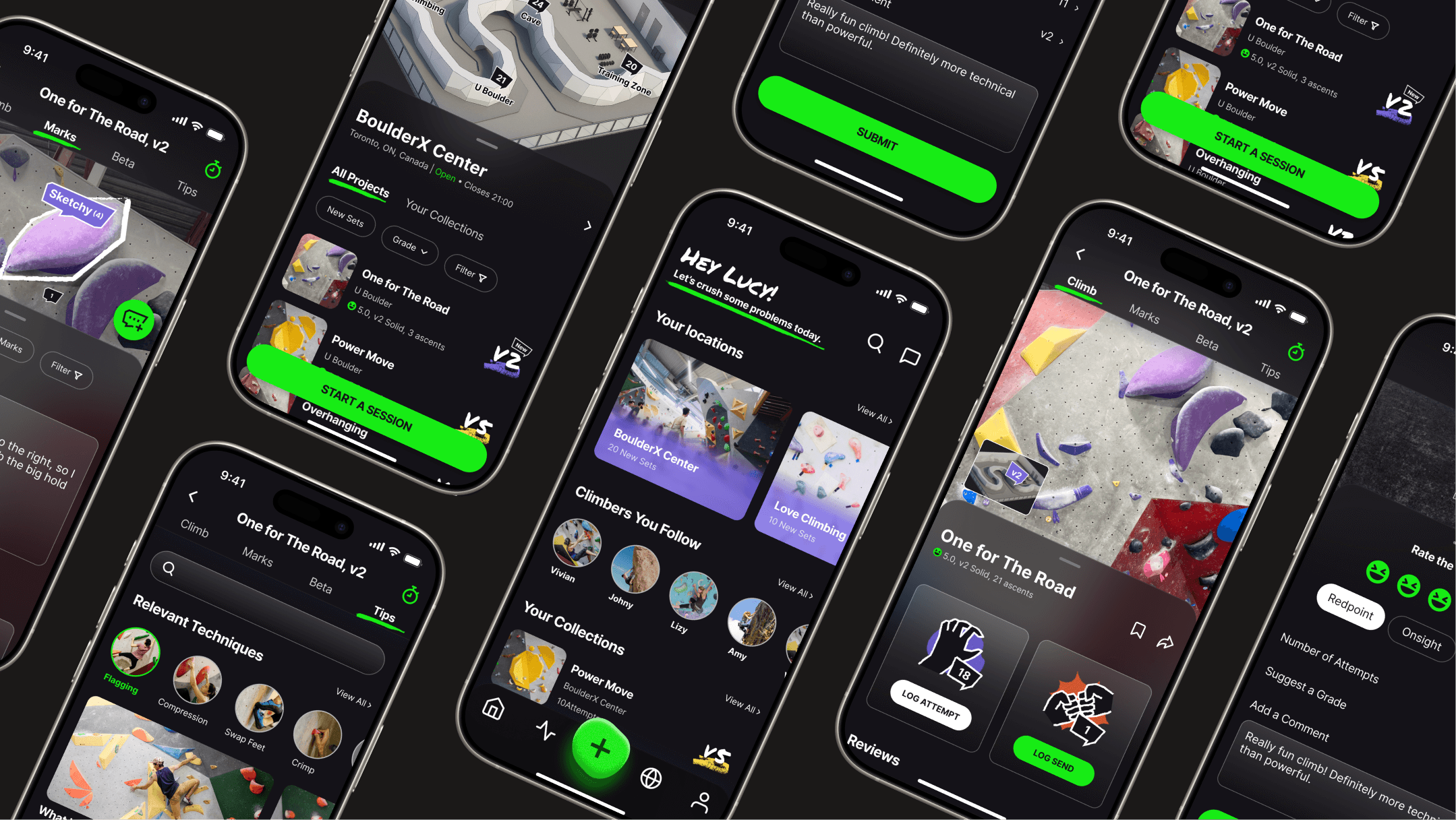
A dynamic collage of multiple mobile screens from the WALLZ climbing app, showcasing its dark-themed UI and key features. Screens visible include the homepage, a gym detail page, a project detail page ('One For The Road'), and an in-climb tracking interface with beta recording and submission options.

Overview

WALLZ is a mobile app created for Toronto's indoor bouldering community, designed to help beginner and intermediate climbers feel more supportive, collaborative, and insightful by streamlining progress tracking, boosting mutual learning and providing tailored guidance.

Role

Sole UX/UI designer

Tools

Figma, FigJam, Miro

Timeline

May - June 2025 (5 weeks)

Problem

Climbers struggle with lack of guidance, uncertain movement, and feeling alone in their progress.

Climbers—especially beginners and intermediates—often feel unsure how to approach problems, lack technique guidance, and struggle to evaluate their progress. Without the right support, they can feel isolated, intimidated, or unsure how to improve.

Solution

WALLZ streamlines progress tracking and digitalizes community support to build confidence and accelerate learning.

Beyond simply tracking gym projects and progress, WALLZ digitalizes the real-life support found in climbing communities to solve the isolation and skill-gap challenges many climbers face.

By allowing users to mark cruxes, share beta, and learn from climbers with similar body types or skill levels, WALLZ builds a collaborative, connected climbing experience —reducing guesswork and turning progress into a shared journey.

Impact

Key Measurable Outcomes
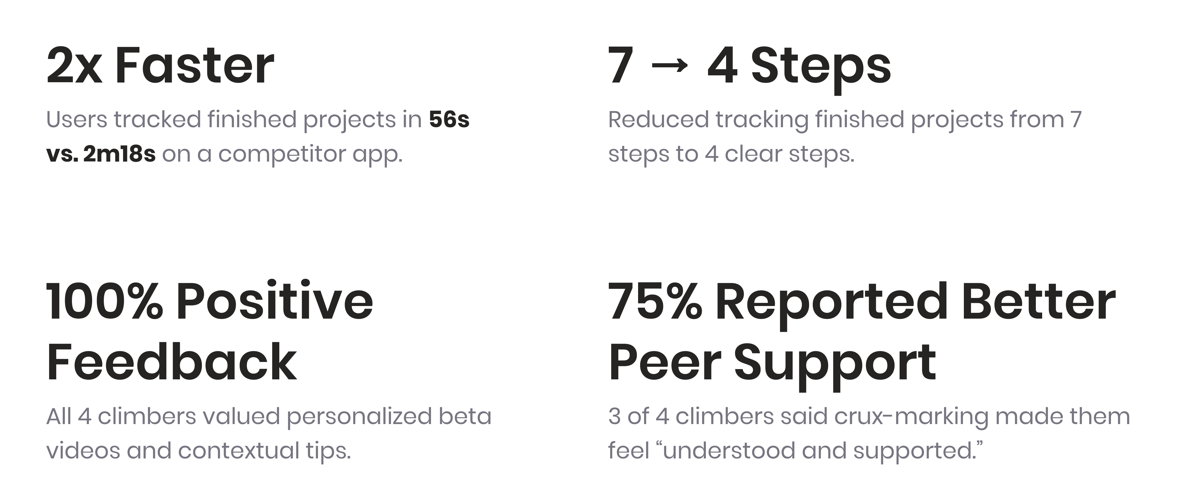
Four white cards under the heading “WALLZ Impact” display key usability testing results:

“2× Faster – Users tracked finished projects in 56s vs. 2m18s on a competitor app.”

“7 → 4 Steps – Reduced tracking finished projects from 7 steps to 4 clear steps.”

“100% Positive Feedback – All 4 climbers valued personalized beta videos and contextual tips.”

“75% Reported Better Peer Support – 3 of 4 climbers said crux-marking made them feel ‘understood and supported.’”

Project Workflow

Diagram illustrating the project workflow for the WALLZ app design. The steps are: User Research, User Flow, Low-Fidelity Prototype, Medium-Fidelity Wireframes, User Test, Mood Board, Deepening Insights and Evolving the Solution, and High-Fidelity Wireframes.

User Research

Where Climbers Feel Stuck and Unsupported

Gathering the Data

I launched a user survey to explore bouldering climbers habits and references of bouldering. 6 climbers submitted survey questions, and I got in touch with three of them for interview.
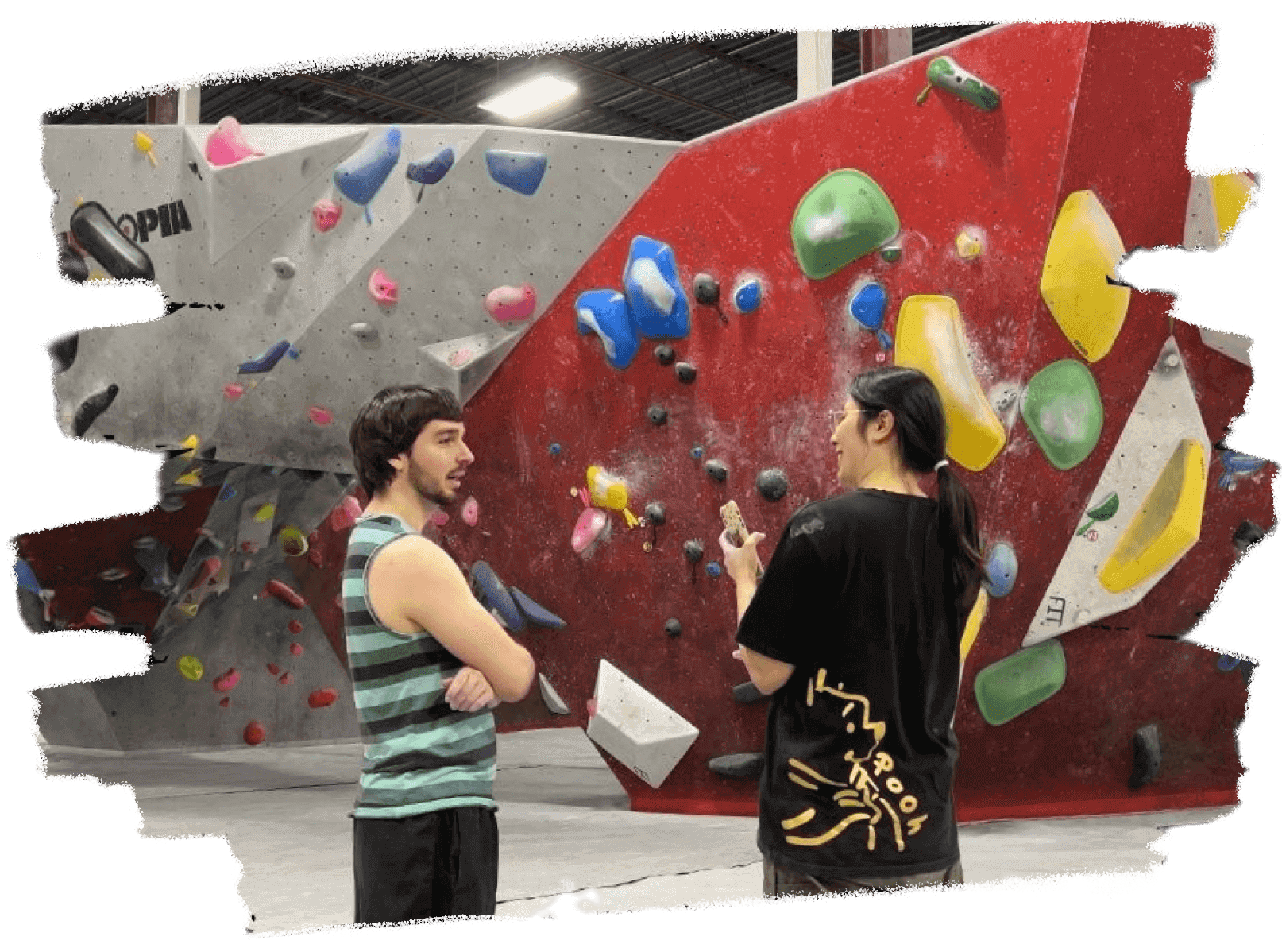
Product designer Lucy Lu conducting user research, interviewing a male climber in a bouldering gym. They are standing in front of a red and grey climbing wall with various colored holds.
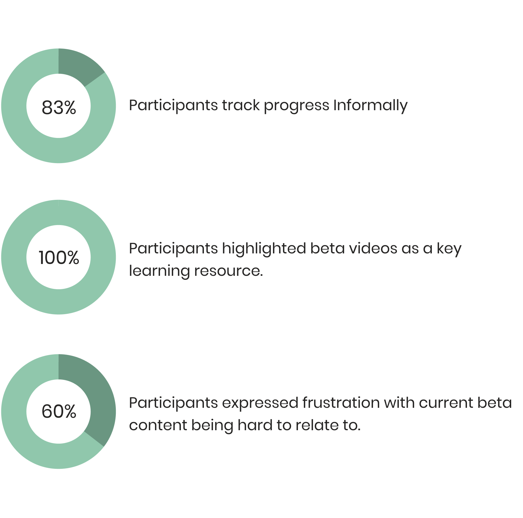
Summary of user research results for the WALLZ app, presented with pie charts. Key findings include: 83% of participants track progress informally, 100% highlighted beta videos as a key learning resource, and 60% expressed frustration with current beta content being hard to relate to.
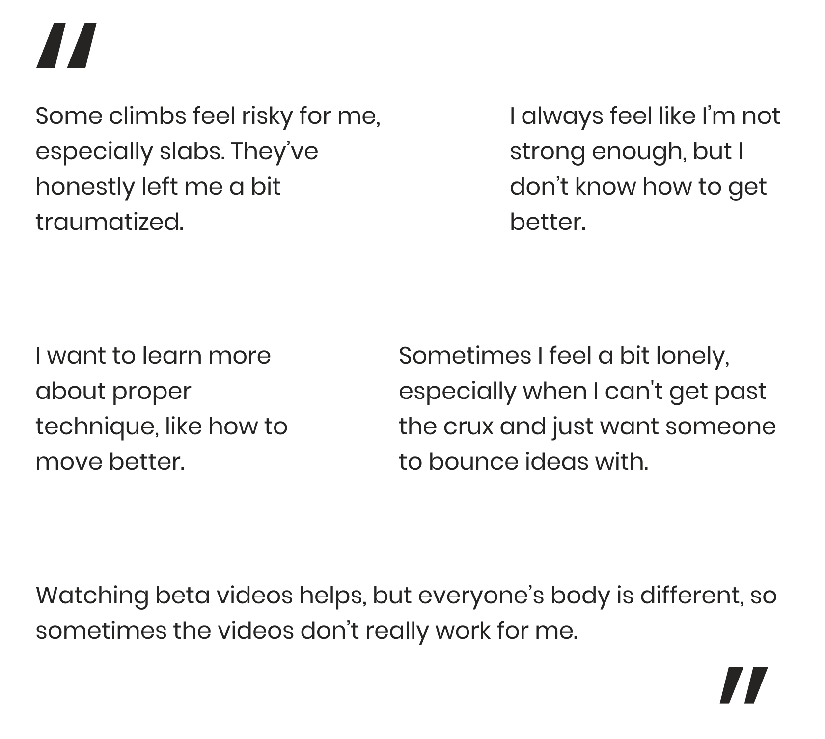
Key quotes from user research participants for the WALLZ app. Quotes highlight challenges such as: "Some climbs feel risky for me, especially slabs. They've honestly left me a bit traumatized." "I always feel like I'm not strong enough, but I don't know how to get better." "I want to learn more about proper technique, like how to move better." "Sometimes I feel a bit lonely, especially when I can't get past the crux and just want someone to bounce ideas with." "Watching beta videos helps, but everyone's body is different, so sometimes the videos don't really work for me."

Meet the People Behind the Problems

Based on what I learned from the survey and interviews, I created two personas and mapped out their typical climbing journeys.
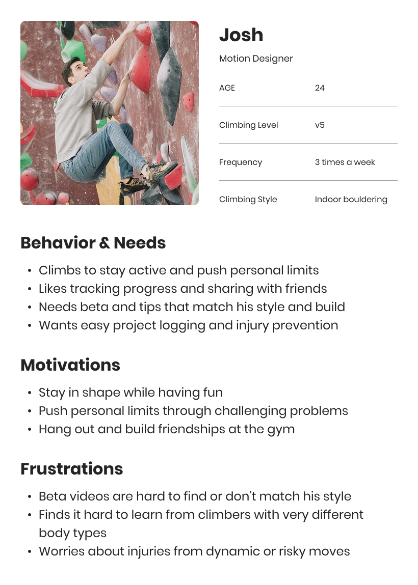
User Persona 1: Josh, a 24-year-old Motion Designer with a V5 climbing level, climbing 3 times a week, focused on indoor bouldering. His behaviors include climbing to stay active, tracking progress, and needing relevant beta. Motivations are staying in shape, pushing limits, and building friendships. Frustrations include hard-to-find beta videos, difficulty learning from different body types, and injury worries. The image shows a photo of Josh climbing on a bouldering wall.
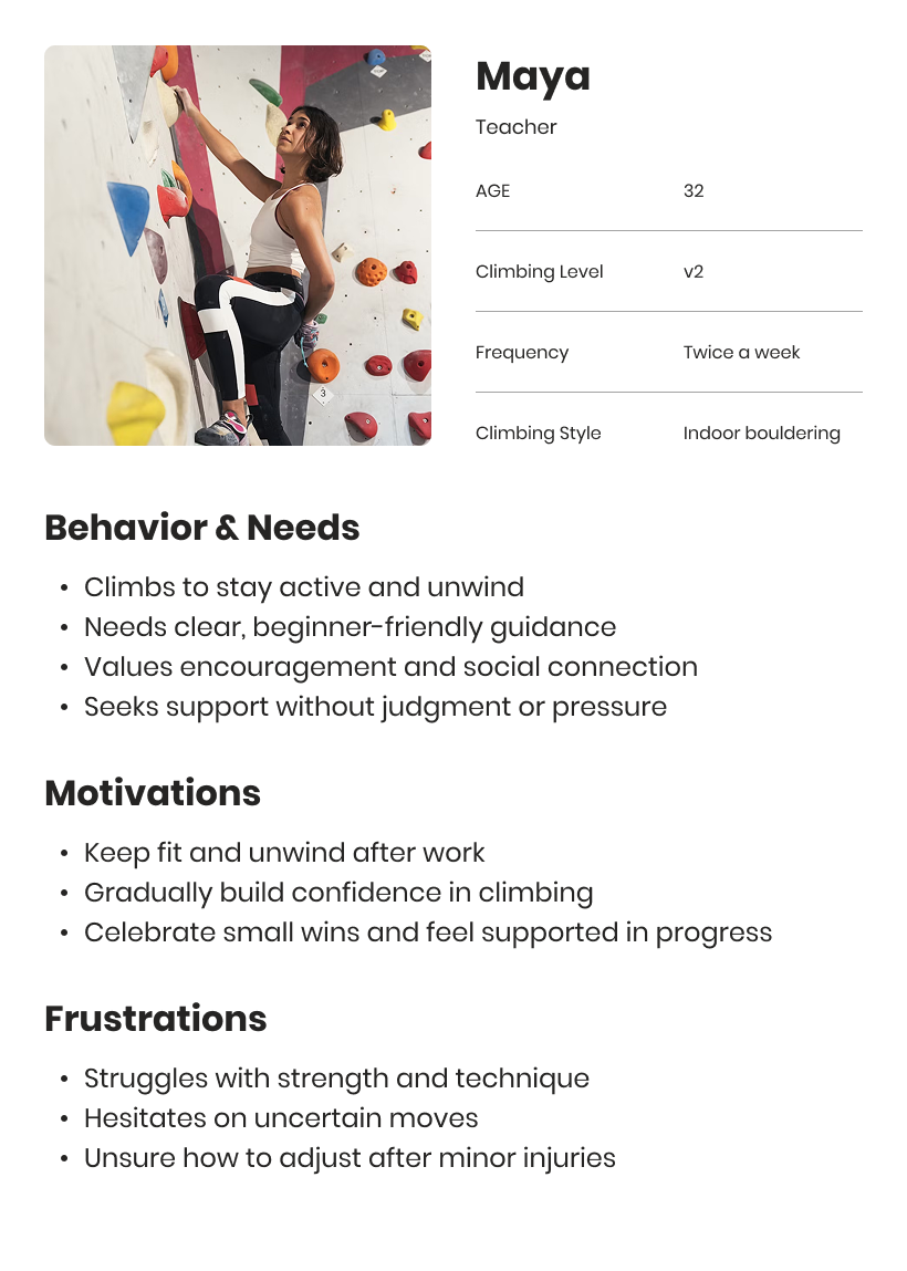
User Persona 2: Maya, a 32-year-old teacher with a V2 climbing level, climbing twice a week, focused on indoor bouldering. Her behaviors and needs include climbing for activity and unwinding, needing clear beginner guidance, and valuing social connection and support without judgment. Motivations are keeping fit, building confidence, and celebrating small wins. Frustrations include struggles with strength/technique, hesitation on uncertain moves, and uncertainty about adjusting after minor injuries. The image shows a photo of Maya climbing on a bouldering wall.
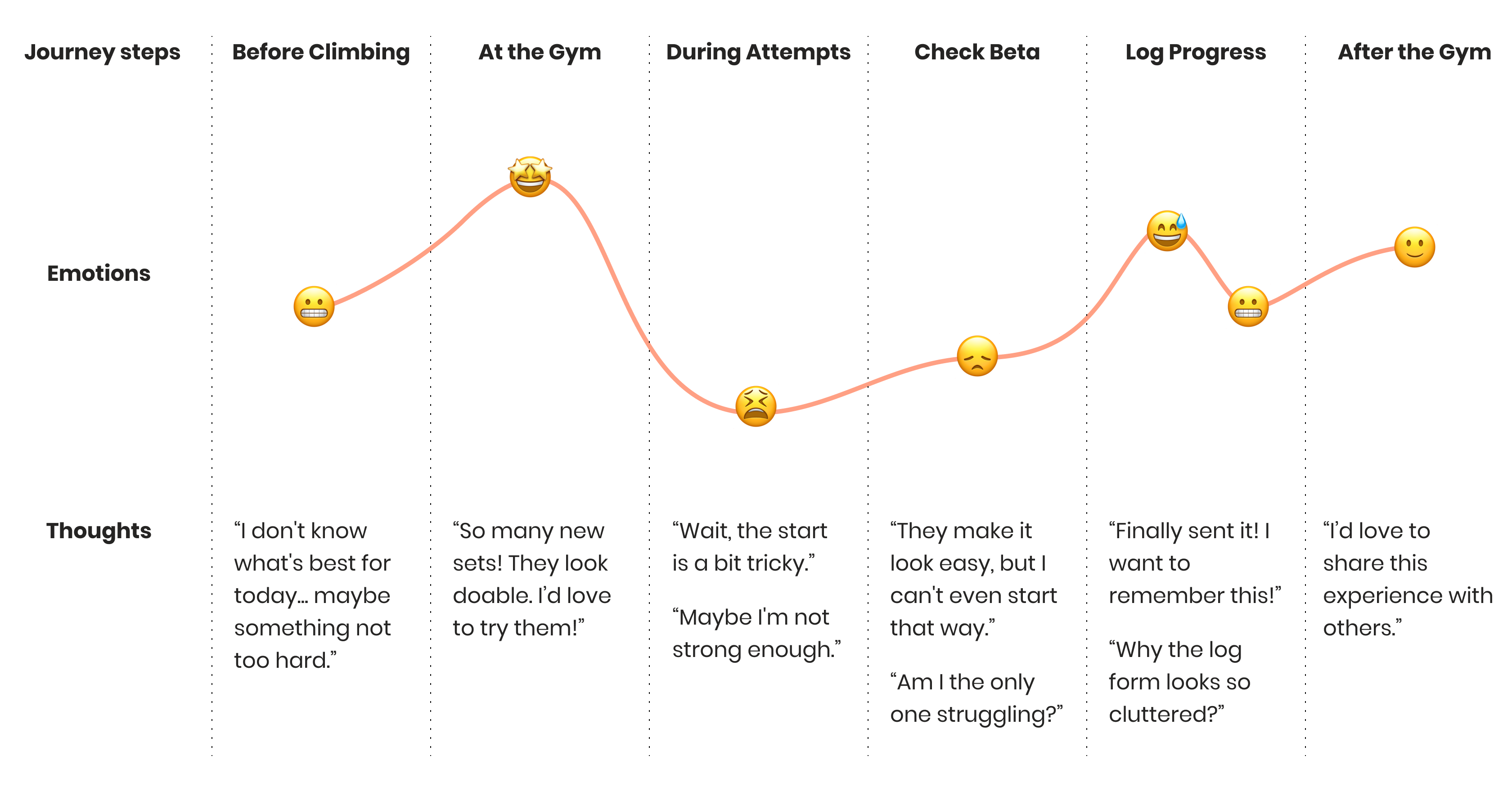
User Journey Map for a climber, broken down into steps: Before Climbing, At the Gym, During Attempts, Check Beta, Log Progress, and After the Gym. For each step, it details actions, touchpoints, emotions (with emojis like uncertain, excited, confused, frustrated, proud, warm, confident), thoughts, pain points, and opportunities identified, such as simplifying log forms and prioritizing relevant beta videos.

Problem Statement

What Pain Points Am I Solving for Users?
User Pain Point 1: Lack of Guidance & Technique Support
User Pain Point 2: Unrelatable or Inaccessible Beta Content
User Pain Point 3: Limited Social Support & Motivation
User Pain Point 4: Poor Progress Tracking Experience

User Flow

Turning Pain Points into Improvement
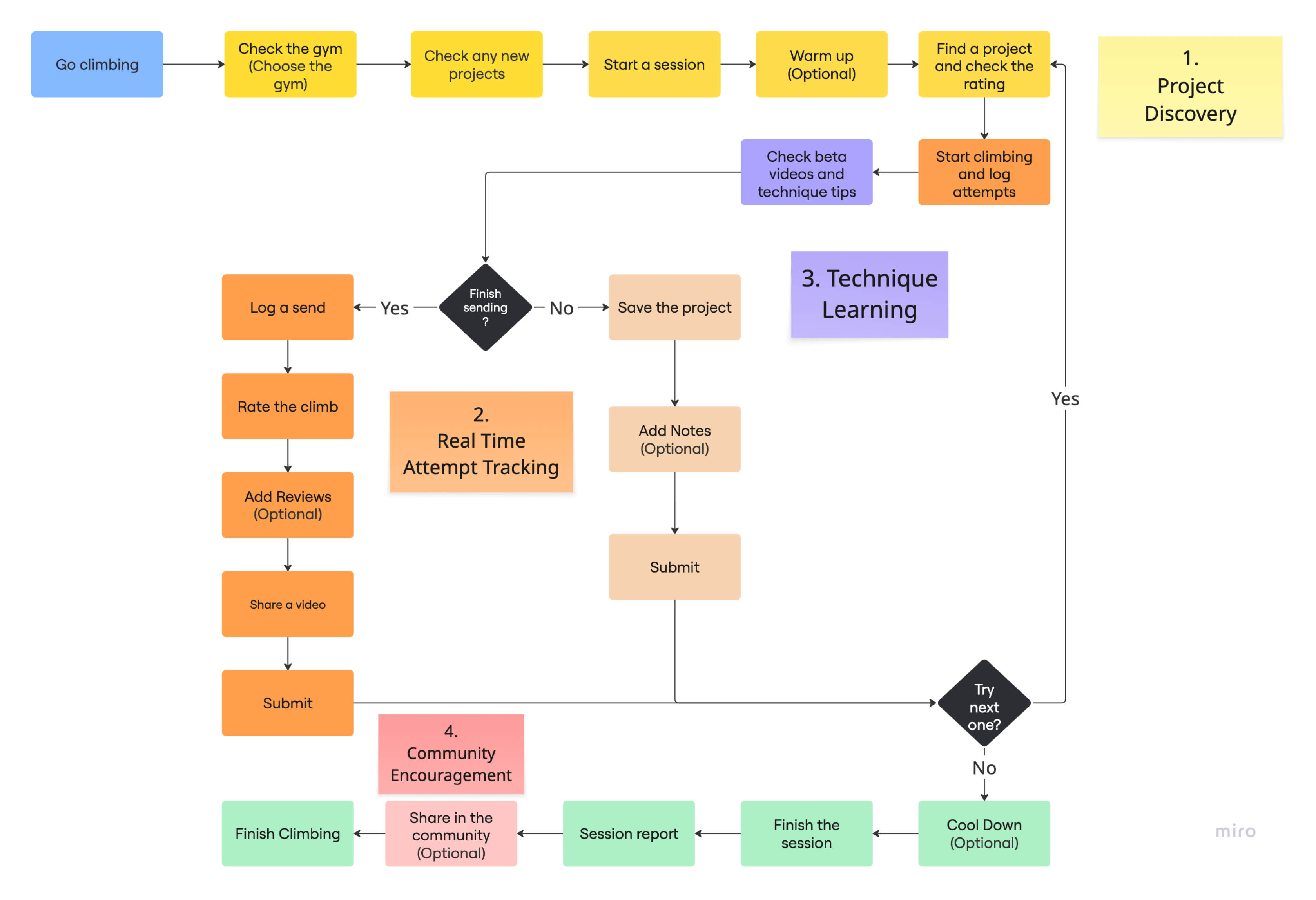
User Flow diagram for the WALLZ climbing app. The flow starts with 'Go climbing' and branches through 'Check the gym', 'Check any new projects', 'Start a session', 'Warm up', 'Find a project', and 'Check beta videos'. Key sections highlighted are 'Project Discovery', 'Real Time Attempt Tracking', 'Technique Learning', and 'Community Encouragement'. The flow includes actions like 'Log a send', 'Rate the climb', 'Add Notes', 'Submit', and 'Share a video', along with decision points like 'Finish sending?' and 'Try next one?'.

Mid-Fi Wireframes

Ideating Solutions through Key User Scenarios

Scenario 1: Project Discovery

Place recently visited climbing gyms at the top of the home screen to improve quick access.
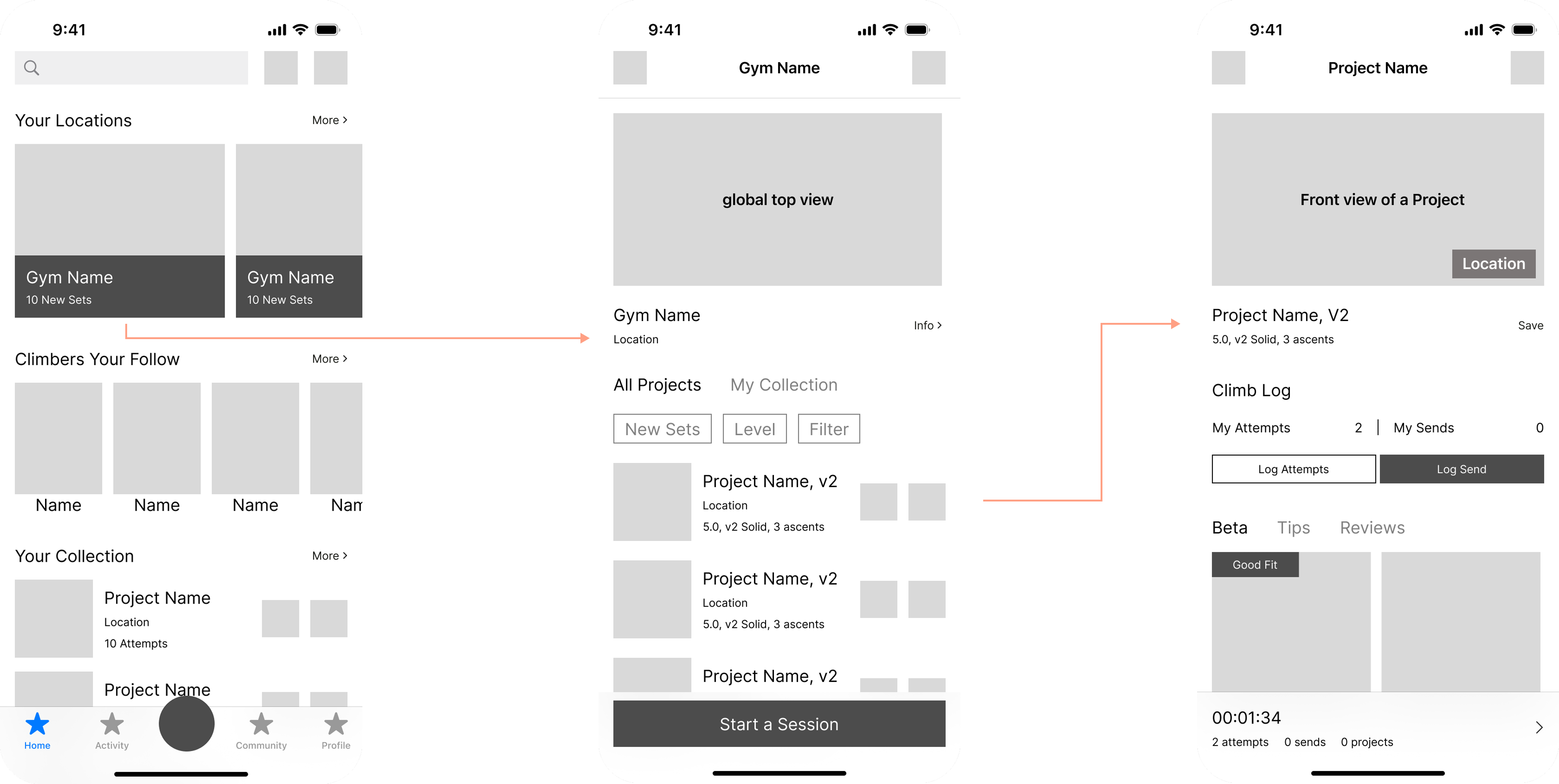
Mid-fidelity wireframes for WALLZ app, illustrating the 'Project Discovery' flow (Scenario 1). The first screen is the homepage with 'Your Locations' (recently visited gyms) prominently at the top, followed by 'Climbers You Follow' and 'Your Collection'. Tapping a gym leads to the second screen, a gym detail page with a 'global top view' map and a list of climbing projects. Tapping a project leads to the third screen, the project detail page.

Scenario 2: Real Time Attempt Tracking

  • When users tap “Log Send,” show a positive feedback popup to encourage and reward them. After 5 seconds or when tapping outside the popup, automatically redirect them to the log form page.

  • On the form page, prioritize the video upload section to motivate users to share their beta videos.

Mid-fidelity wireframes for WALLZ app, illustrating the 'Real Time Attempt Tracking' flow (Scenario 2). The first screen is a project detail page. Tapping 'Log Send' triggers a 'Congrats! You did it!' positive feedback pop-up on the second screen. This then leads to the third screen, a 'Log Send' form page that prioritizes the 'Upload Beta/Images' section, followed by climb rating, number of attempts, suggested grade, and review options.

Scenario 3: Technique Learning

  • On the project detail page, users can view beta videos, with those uploaded by climbers of similar skill level and body type shown first.

  • In the Tips section, users can explore technique-related content and training videos recommended by the platform based on the current project.
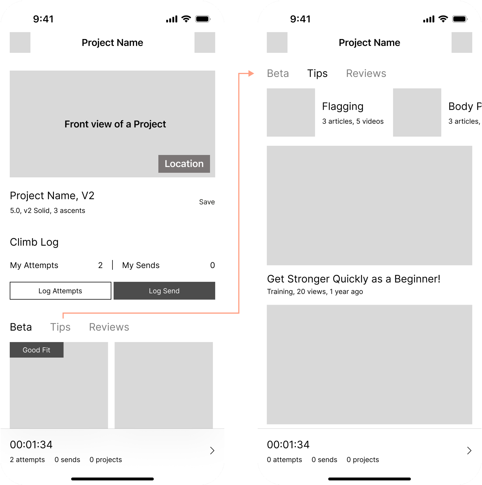
Mid-fidelity wireframes for WALLZ app, illustrating the 'Technique Learning' flow (Scenario 3). The left screen is a project detail page with tabs for 'Beta', 'Tips', and 'Reviews'. The 'Beta' section highlights relevant beta videos. An arrow indicates a transition to the right screen which is the 'Tips' section, showing suggested technique articles and training videos like 'Get Stronger Quickly as a Beginner!', designed to help users improve based on the current project.

Scenario 4: Community Encouragement

  • After completing a session, users receive a positive feedback popup along with a session summary. They can choose to share the report with the community to spark more interaction.

  • This helps users effectively track their climbing records and stay motivated through encouragement from both the platform and the community.
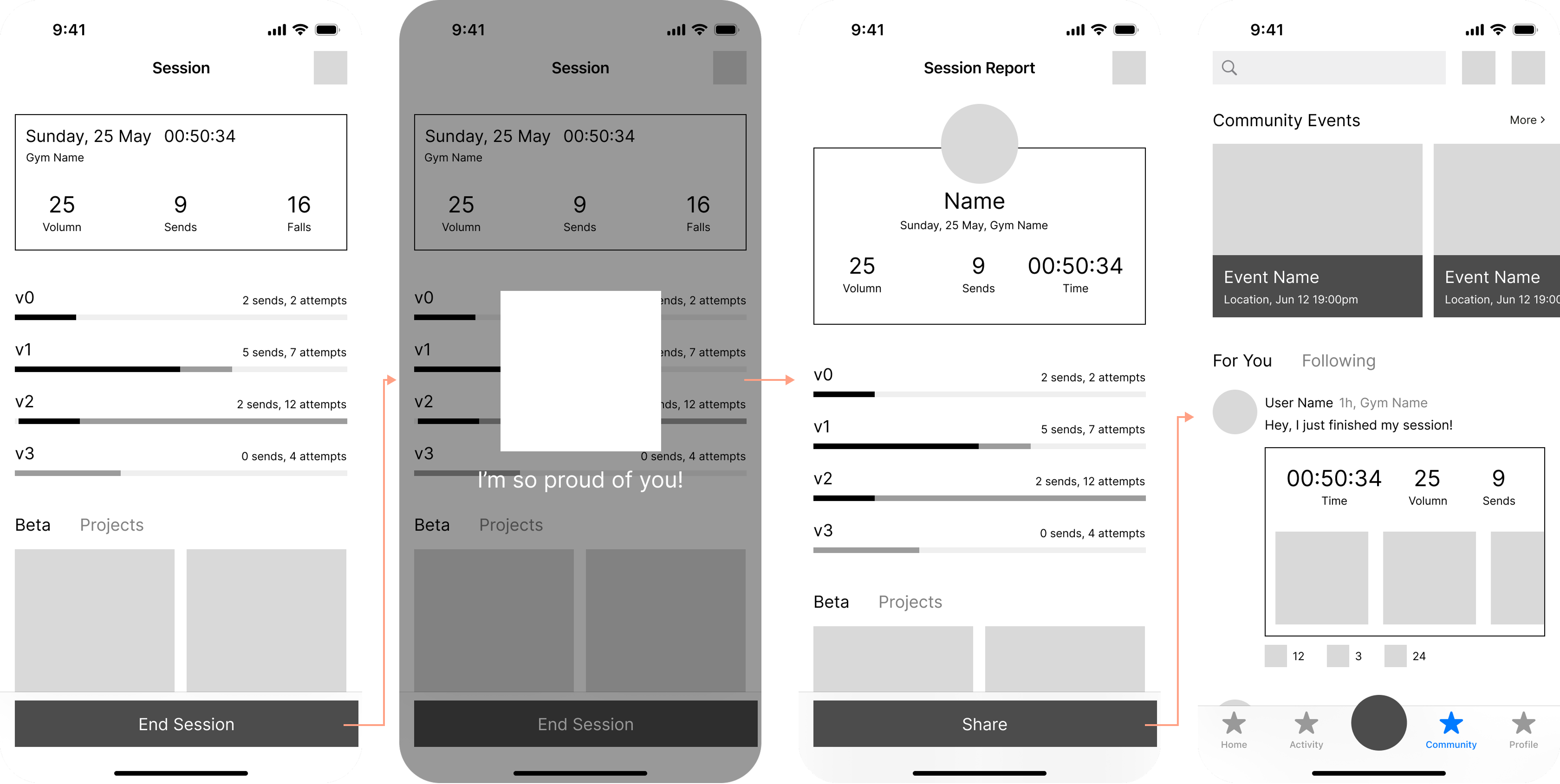
Mid-fidelity wireframes for WALLZ app, illustrating the 'Community Encouragement' flow (Scenario 4). The first screen shows a session summary. Tapping 'End Session' triggers an 'I'm so proud of you!' positive feedback pop-up on the second screen. This leads to the third screen, a detailed session report with options to 'Share'. The fourth screen shows the 'Community Events' feed, where the shared session report appears, along with other community interactions, fostering motivation and connection.

Questions Raised during User Testing

How Can I Go Beyond Generic Advice to Support Individual Needs?

While participants responded positively during user testing, some asked whether there were more personalized and relevant solutions to help them enjoy climbing even more.

User feedback quote from testing: "Sometimes I feel the beta video helped, but I still couldn't send it. I feel like I missed something important. Am I the only one stuck on that part?" This highlights a user's frustration.
User feedback quote from testing: "The little support message is nice, but I wish it felt more personal, like from a real climber." This indicates a desire for more authentic encouragement.

Contextual Inquiry

Finding the Gap in Real Climbing Conversations

Climbers love talking about climbing.
Take my friend Max and me, for example — whether we’re climbing together or apart, we often share updates about our challenges and progress on the wall.
Most of our conversations revolve around one thing: the tricky parts of a climb.

Seeking Shared Understanding

When facing a climbing problem, the questions naturally become:

  • What’s the obstacle?

  • How can I solve it?

  • What do others feel about this?

  • How do they address it?

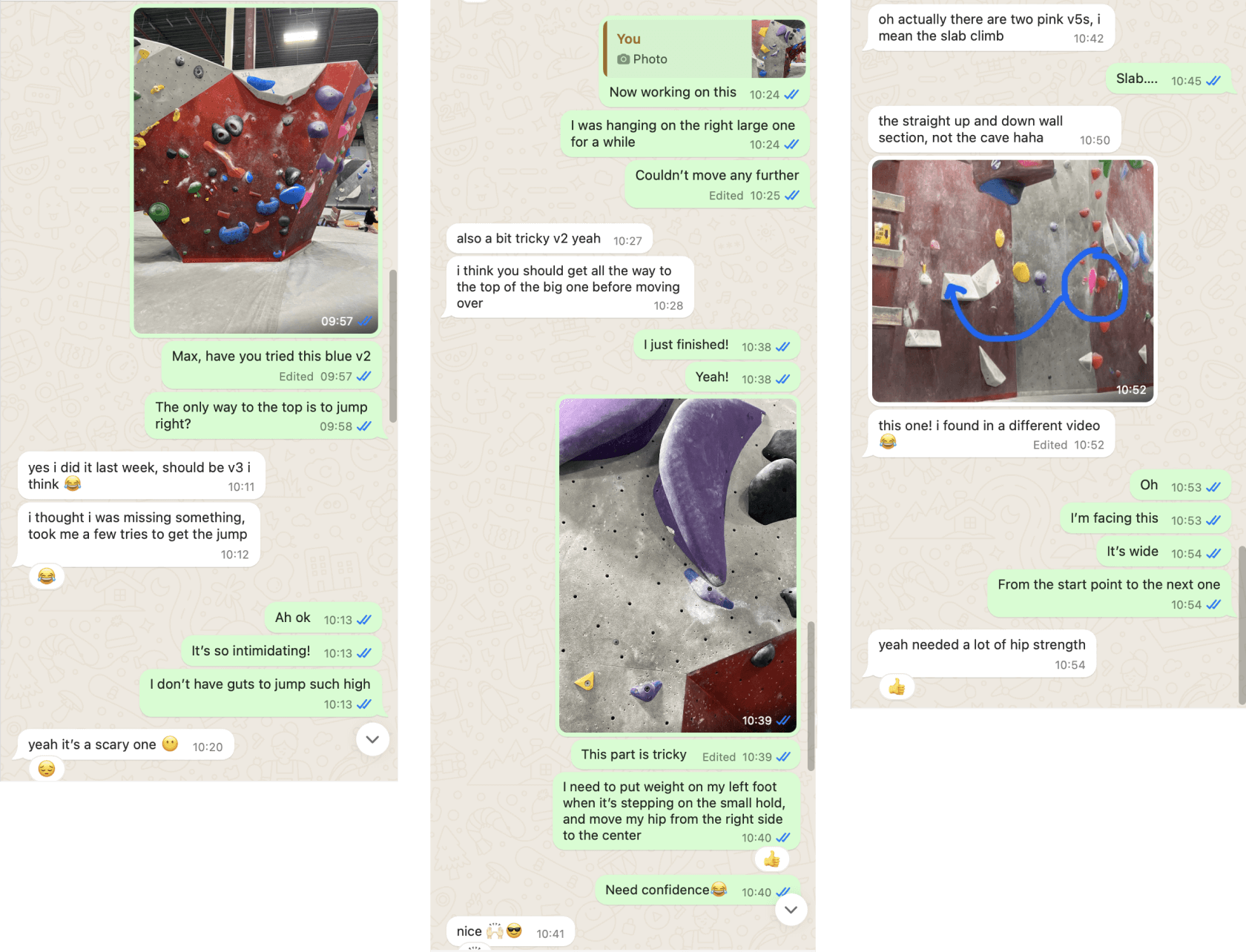
Screenshot of a chat conversation between a designer and a climbing peer about climbing cruxes, tips, and feelings. The discussion includes photos of climbing routes and detailed textual advice on technique and specific moves, demonstrating a real-life exchange of beta.

This made me realize:

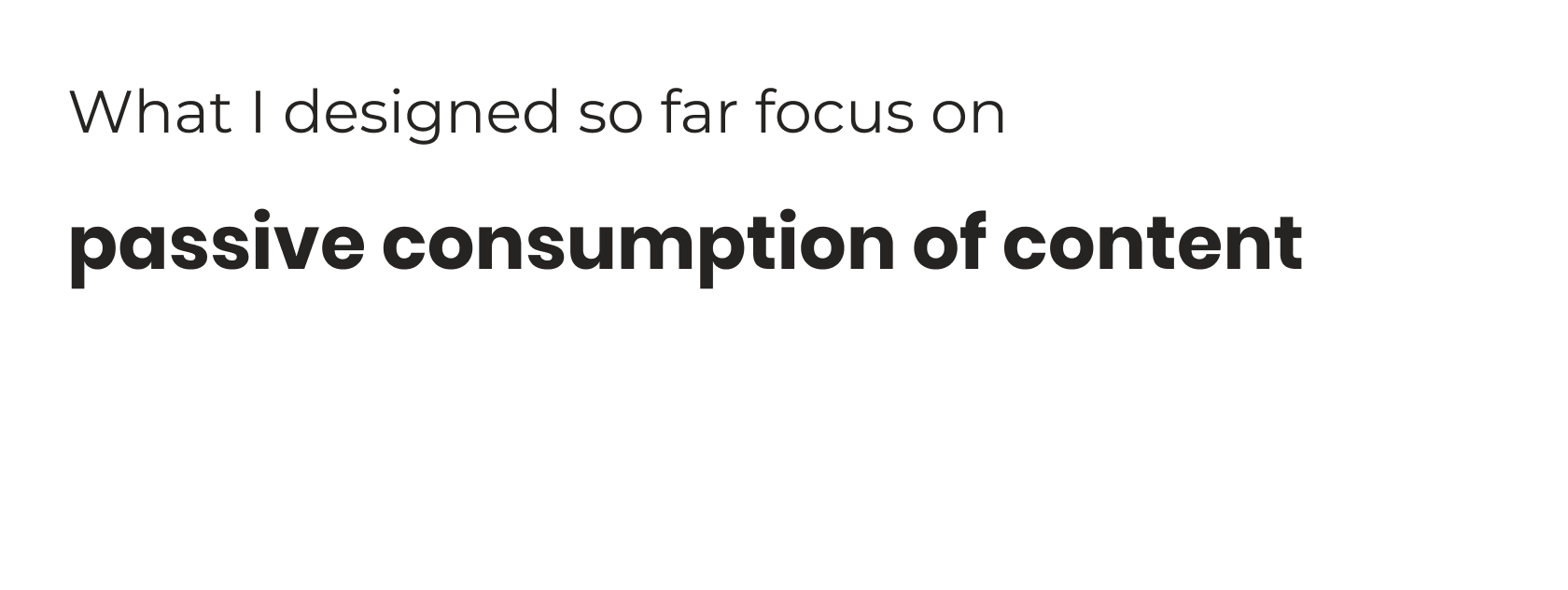
Text box stating "What I designed so far focus on passive consumption of content," highlighting a limitation in the current solution.
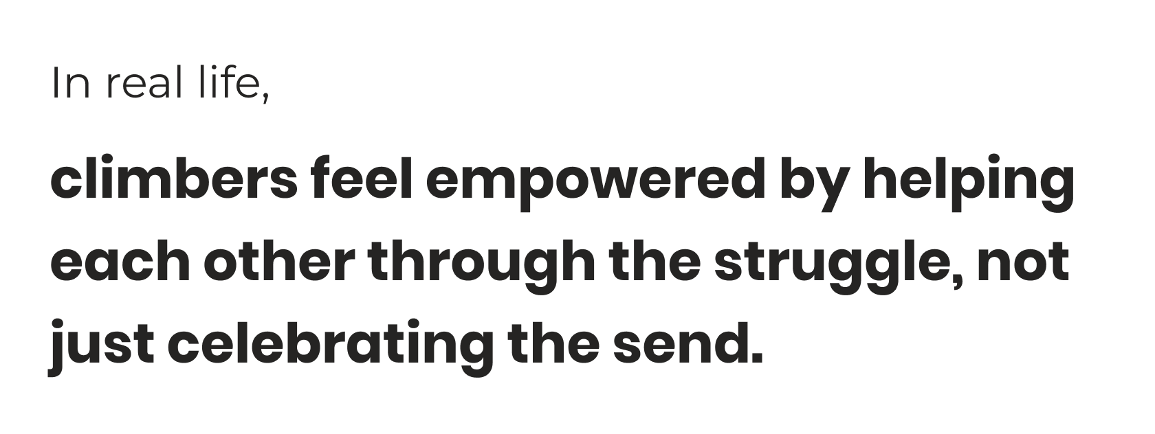
Text box stating "In real life, climbers feel empowered by helping each other through the struggle, not just celebrating the send." This indicates a missed opportunity for fostering collaborative support in the app.

Framing a New Challenge

How Might I...

create a digital space where climbers can openly discuss unfinished projects, share their thoughts, and support each other—so that even in struggle, they feel connected, encouraged, and part of a climbing community?

I defined key adjectives to guide my design thinking for the digital experience:

Informative

Collaborative

Supportive

Comparative Analysis & Design Solution

From Inspiration to a Core Solution: Marking Cruxes

I conducted a comparative analysis to explore products that embody qualities I want to bring into WALLZ—collaborative, informative, and supportive experiences. What they have in common: These products have user-generated content or/and community-driven communication, whether synchronous or asynchronous.
A collage of various app logos for a comparative analysis, including Figma, Notion, Google Maps, Reddit, Wikipedia, and Discord. This visually represents the scope of competitor or inspiration analysis.

A Core Solution: Marking & Discussing Cruxes

After analyzing products with strong collaborative and contextual design, I crafted solutions that make WALLZ more community-driven, interactive, and responsive to the real challenges climbers face on the wall.

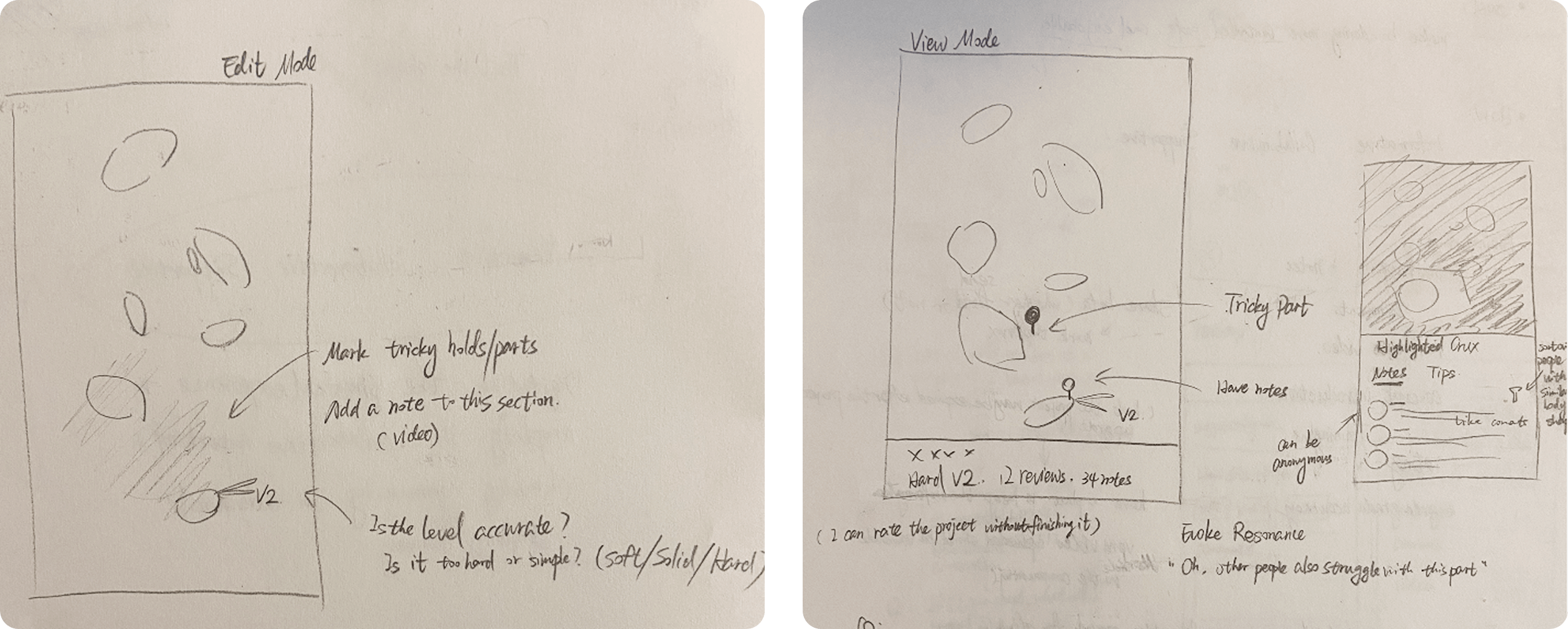
Diagram showing inspiration to design solutions for the WALLZ app. Google Maps inspires 'Add a report on the map' leading to the solution 'Mark the crux on a climb'. Notion and Figma inspire 'Collaboratively add notes' leading to the solution 'Add notes to cruxes and discuss with each other'.
Hand-drawn sketches illustrating the solution for marking and discussing climbing cruxes within the WALLZ app. The left sketch shows an 'Edit Mode' for marking tricky holds/parts and adding notes/videos. The right sketch shows a 'View Mode' displaying a marked 'Tricky Part' on a climb, along with notes from other users and tips.

Key Interaction Flow

Organizing Solutions into a Cohesive Flow

I synthesized all the solutions I had defined and focused on structuring the user flow—particularly for the project detail page, where most interactions occur during a climbing session.
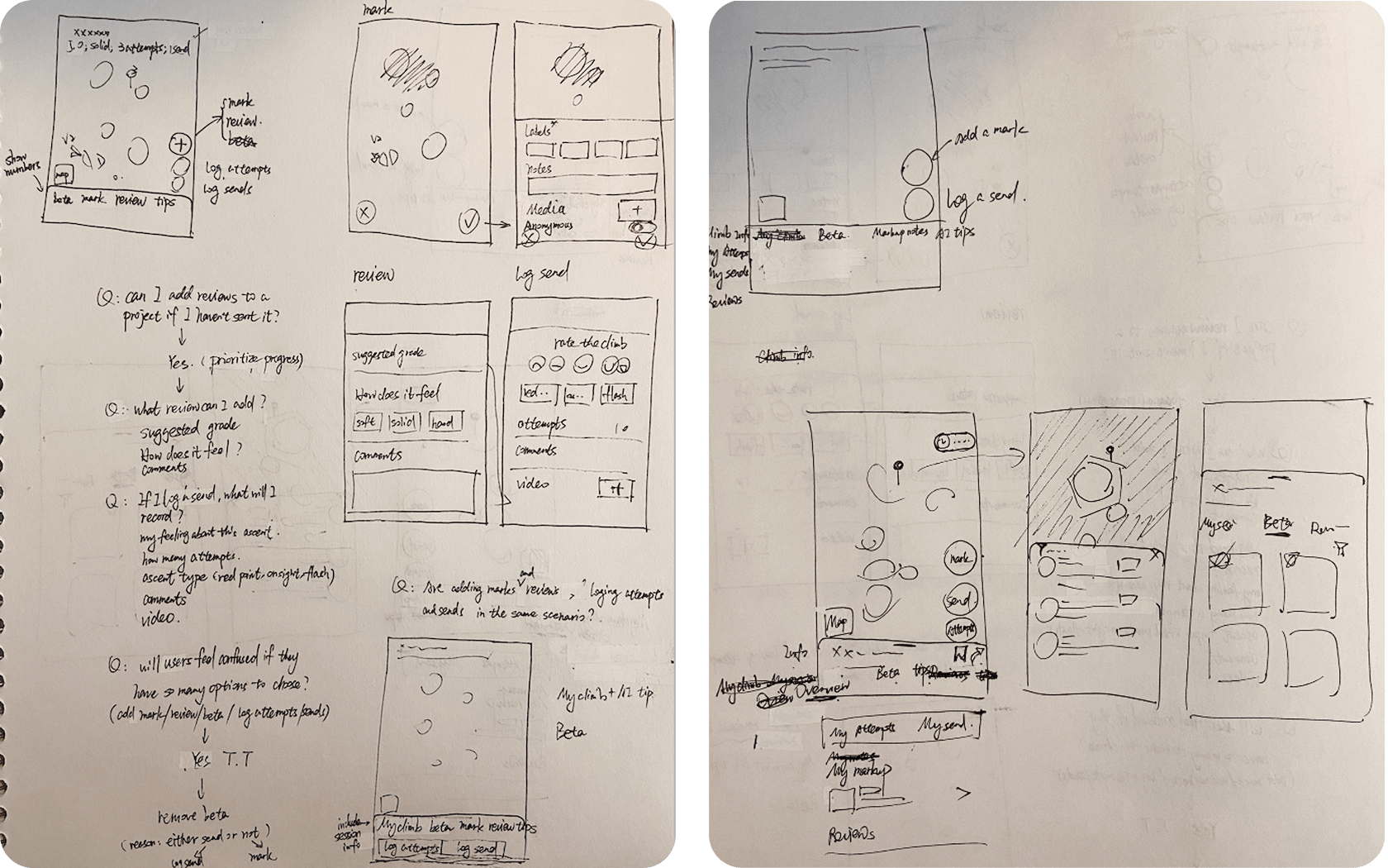
Hand-drawn sketches illustrating possible structures for the WALLZ app's project detail page. The sketches show various layouts for displaying climb details, logging attempts/sends, adding media, and sections for beta, tips, and reviews. Accompanying notes explore questions about adding reviews, media, and options for different types of beta.

Two key scenarios guided this flow:

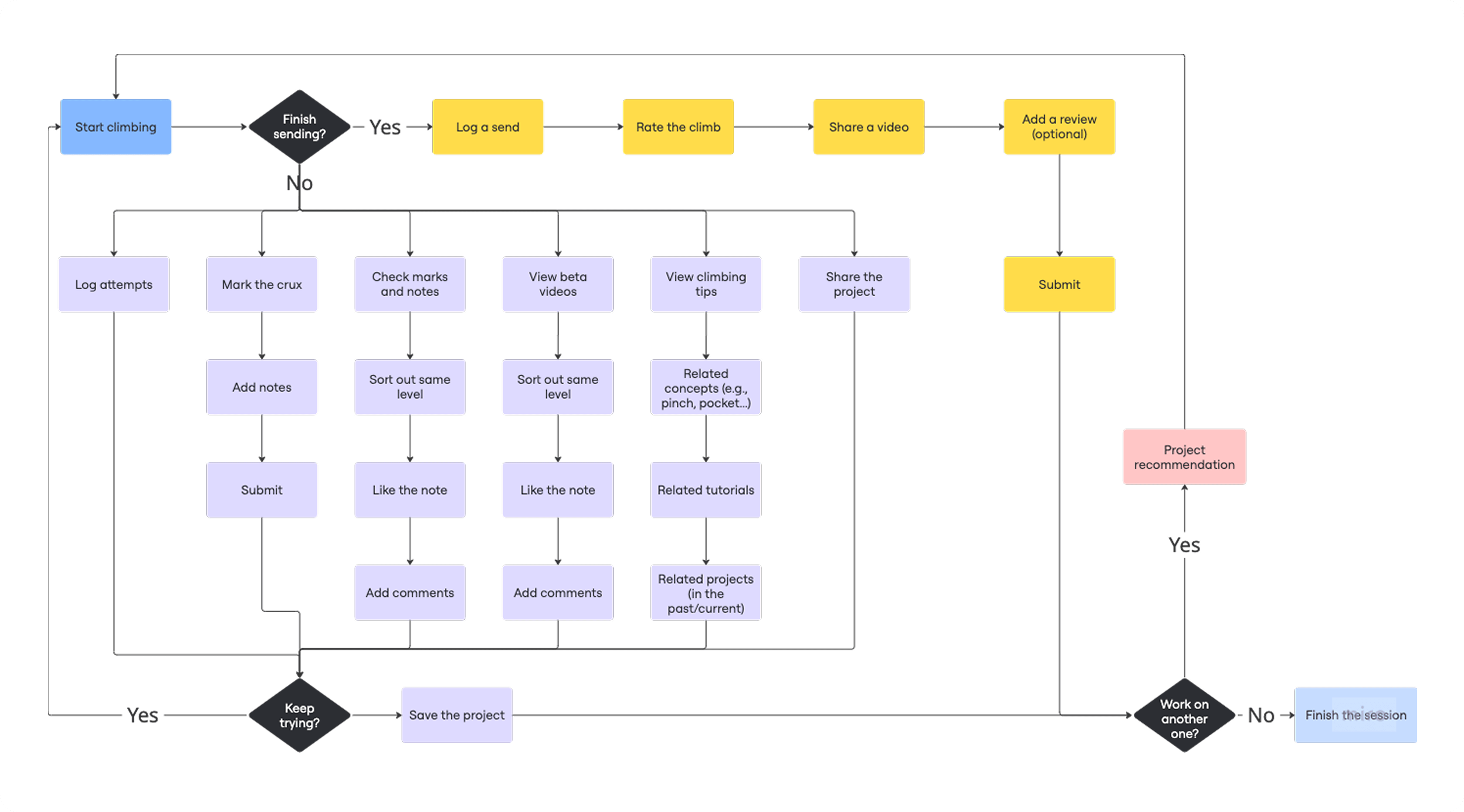
  • Working on a project – logging attempts, marking and adding notes to cruxes, and viewing betas and tips

  • Sending a project – logging a send

Key User Flow diagram for the WALLZ climbing app. The flow begins with 'Start climbing' and branches into two main paths: 'Finish sending?' (Yes or No). The 'Yes' path includes 'Log a send', 'Rate the climb', 'Share a video', 'Add a review', and 'Submit', leading to 'Project recommendation'. The 'No' path involves 'Log attempts', 'Mark the crux', 'Check marks and notes', 'View beta videos', 'View climbing tips', 'Share the project', with options to 'Add notes', 'Like the note', 'Add comments', and 'Submit', culminating in 'Keep trying?' or 'Save the project'.

Mid-Fi Iterations

Bringing the Flow to Life Through Wireframes
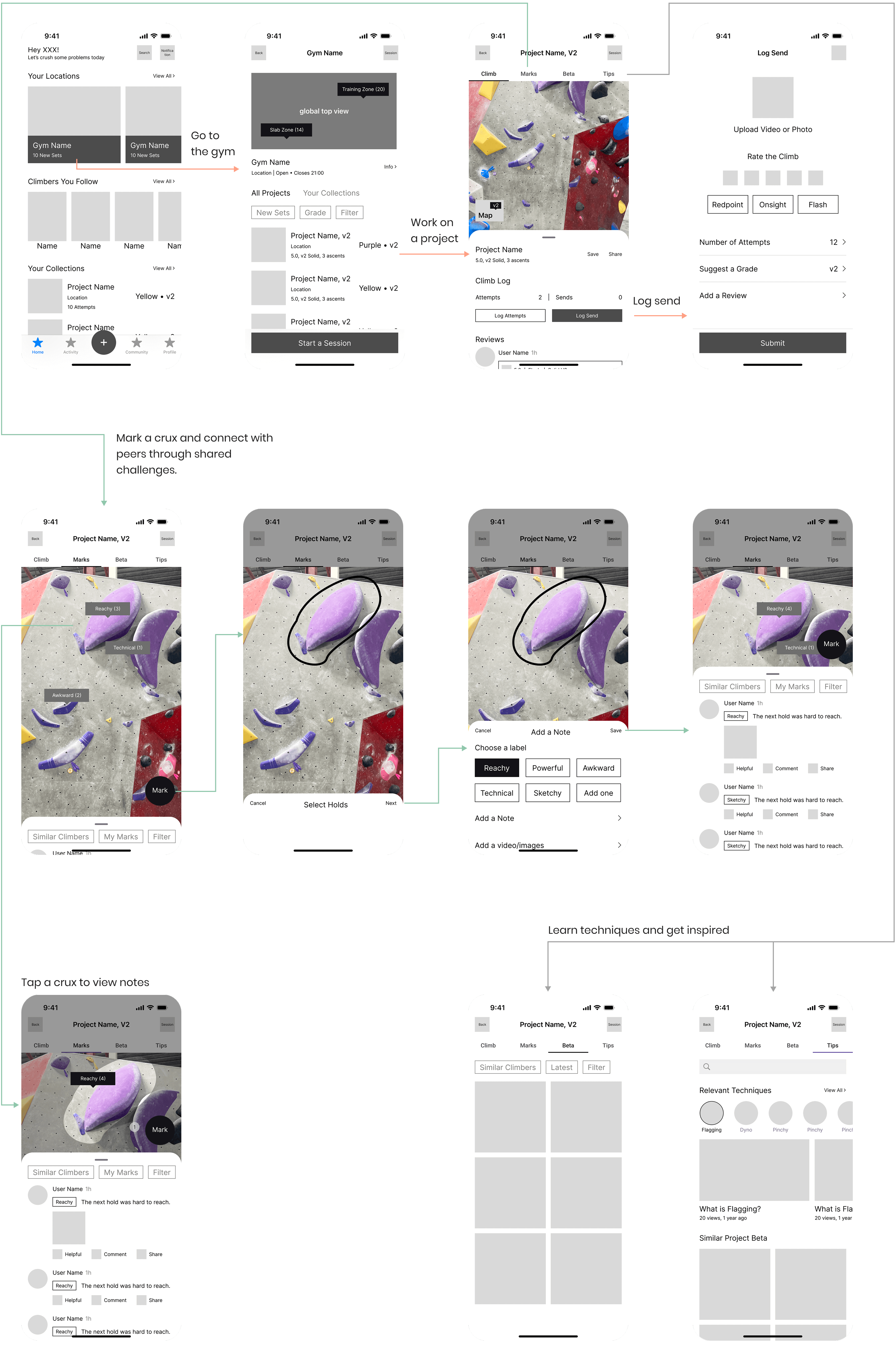
Grid of mid-fidelity wireframes for the WALLZ app, showing design iterations and user flows. The top row illustrates the project discovery and logging send flow, including the homepage, gym detail, project detail, and log send form. The middle row details the 'Mark the crux and connect with peers' flow, showing a project image with highlighted holds and options to add notes or media. The bottom row demonstrates the 'Learn techniques and get inspired' flow, with a project detail page linking to beta videos, tips, and related techniques.

Mood Board

Translating Climbing Vibe into a Visual Identity

WALLZ takes the fun, colorful energy from the mood board and brings it into the app. The brush textures are inspired by real climbing chalk, just like the stuff we use on our hands, making the design feel more real and full of personality.
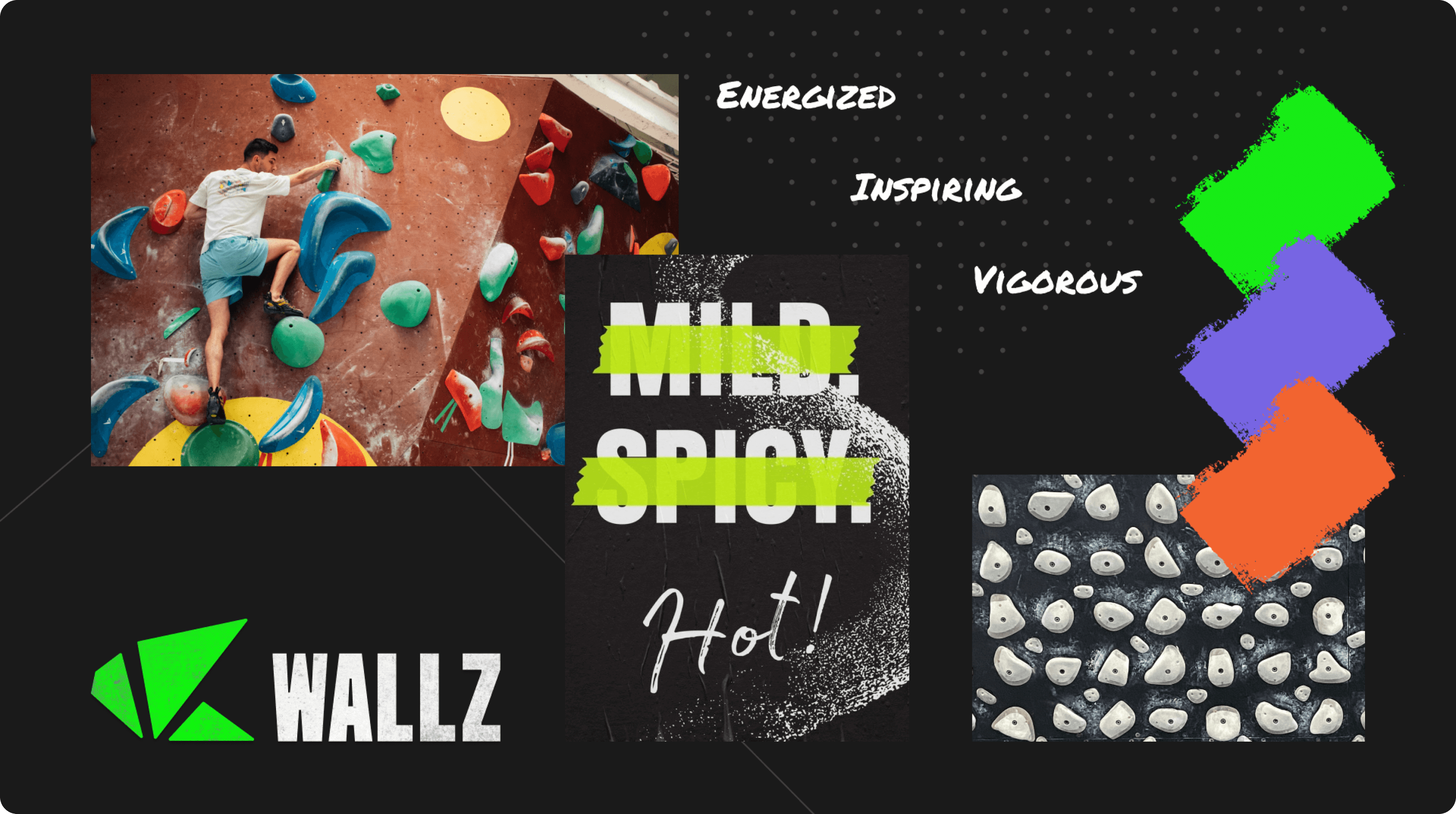
Mood Board for WALLZ app, featuring design inspiration. Elements include a photograph of a climber on a red bouldering wall, the WALLZ logo in green and white, a grungy text overlay that reads "MILD SPICY Hot!", and a color palette of vibrant green, purple, and orange paint swatches. Adjectives 'ENERGIZED', 'INSPIRING', and 'VIGOROUS' are also present, alongside a close-up texture of small climbing holds.

Final design

A Supportive Solution to Isolation and Uncertainty

1. Get motivated and jump into a session quickly at a frequently visited gym.
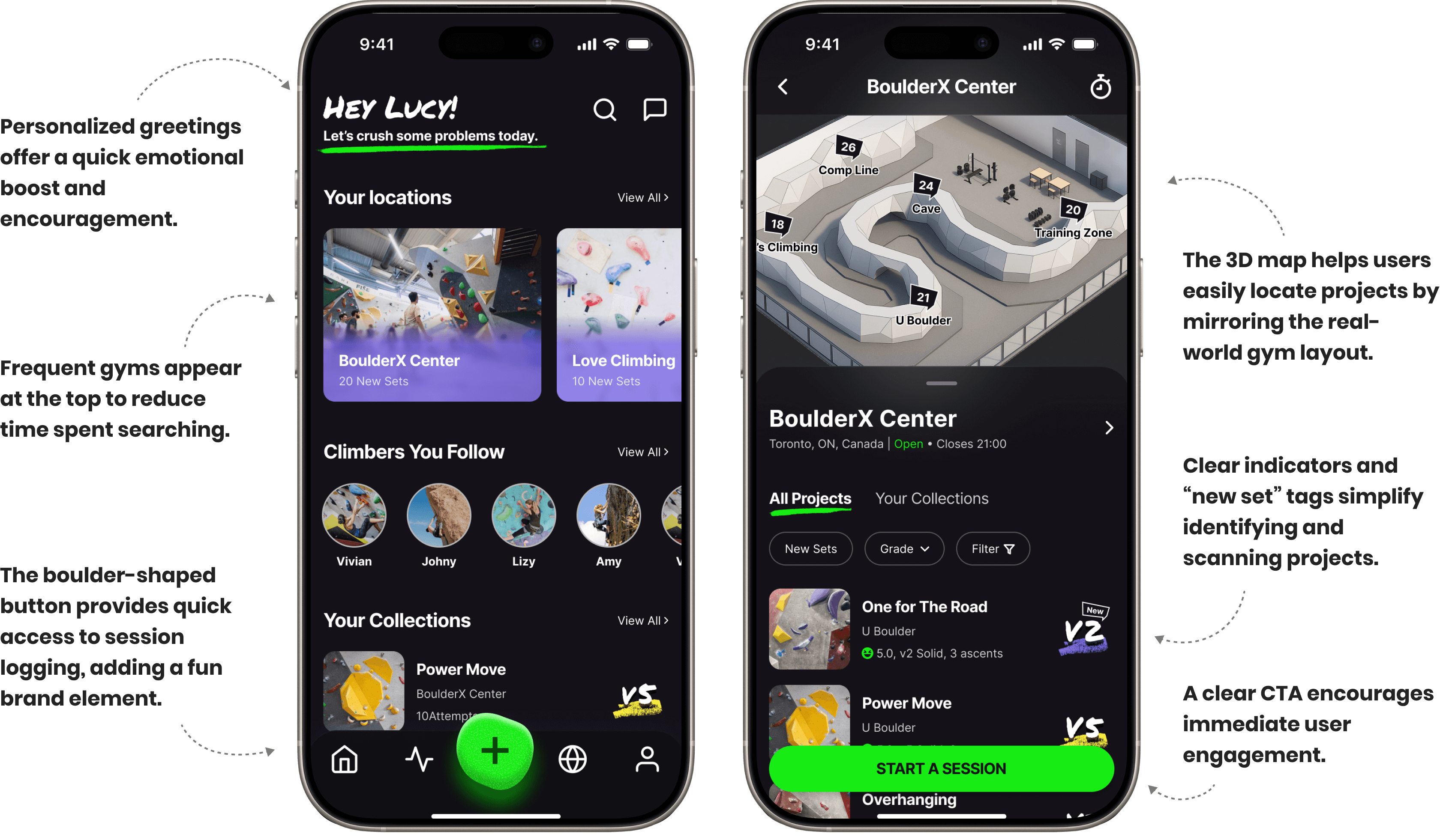
High-fidelity mockups of the WALLZ app, demonstrating how users can get motivated and quickly jump into a climbing session. The left screen shows the homepage with a personalized greeting 'Hey Lucy!' and quick access to frequently visited gyms like BoulderX Center and Love Climbing. The right screen displays the BoulderX Center gym detail page with a 3D map for easy project location and a clear 'Start a Session' call to action, alongside easy project scanning with color and grade indicators.

2. Learn, Send, and Connect – Support That Moves With You
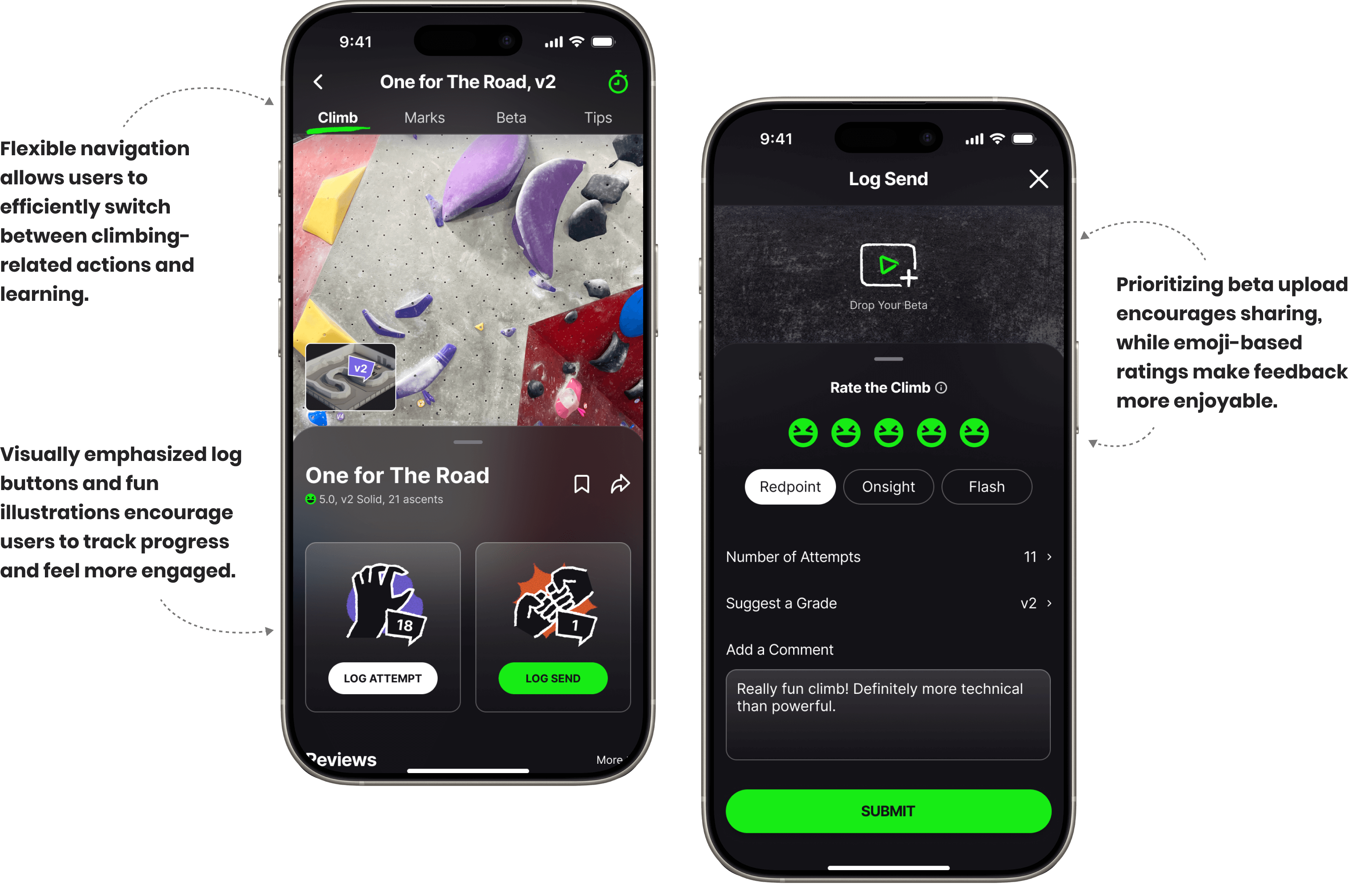
High-fidelity mockups of the WALLZ app, supporting users in logging their climbing attempts and sends. The left screen shows a project detail page with flexible navigation allowing users to efficiently switch between climbing actions and learning, and visually emphasized 'Log Attempt' and 'Log Send' buttons to encourage progress tracking. The right screen displays the 'Log Send' form, which prioritizes beta video uploads for community sharing and uses emoji-based ratings for enjoyable feedback, helping users document their sends effectively.
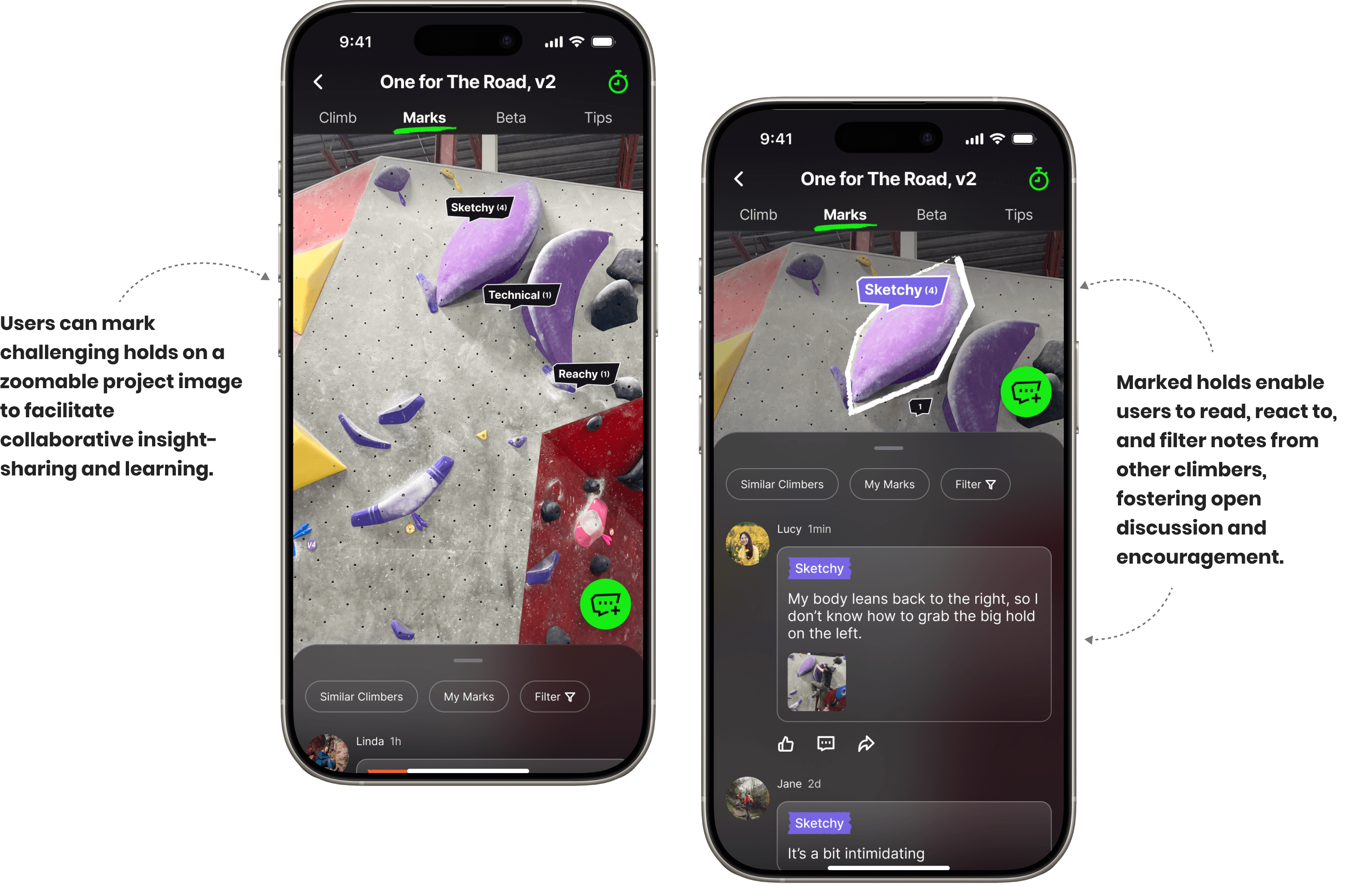
High-fidelity mockups of the WALLZ app, illustrating interactive crux marking and shared discussions. The left screen shows a project detail page where users can mark challenging holds on a zoomable climb image to facilitate collaborative insight-sharing and learning. The right screen displays the 'Marks' tab, where users can read and react to filtered notes from other climbers, fostering open discussion and encouragement.
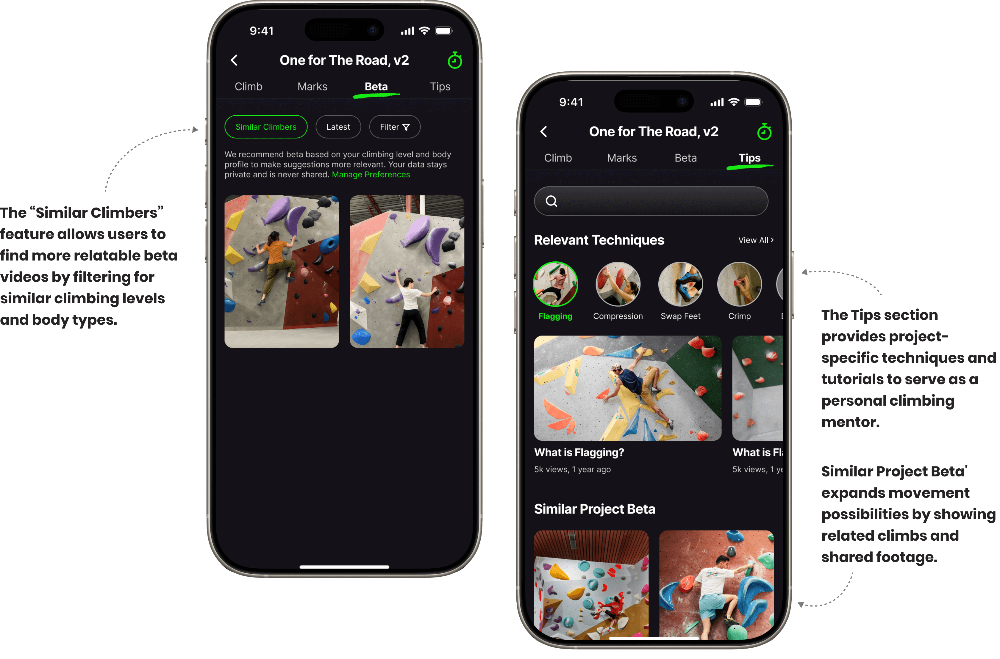
High-fidelity mockups of the WALLZ app, focusing on personalized learning. The left screen shows the 'Beta' section on a project detail page, where the 'Similar Climbers' feature allows users to filter beta videos for more relatable movement styles. The right screen displays the 'Tips' section, providing project-specific techniques and tutorials that serve as a personal climbing mentor, along with 'Similar Project Beta' for broader inspiration.

3. Simple, Guided Flow to Mark and Share Climbing Struggles
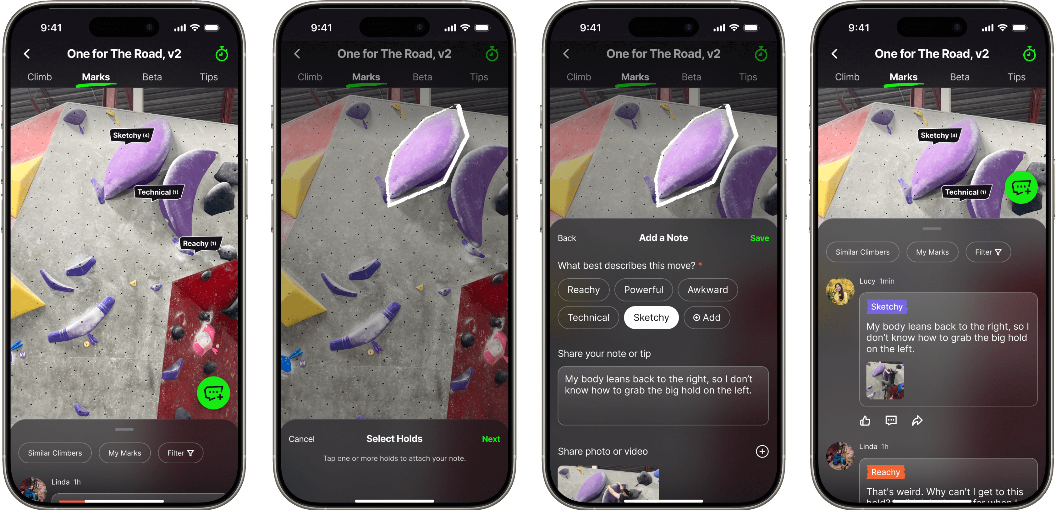
High-fidelity mockups of the WALLZ app illustrating a simple, guided flow to mark and share climbing struggles. The four screens show: first, viewing a climb with existing marked holds; second, selecting a hold to mark; third, adding a note with descriptive tags and text; and fourth, viewing the shared marked hold with discussions and other climbers' comments, fostering collaborative problem-solving.

User Testing

Why WALLZ Makes a Difference

To validate my design choices, I conducted a comparative usability test with 4 climbers, evaluating WALLZ against the widely used Vertical-Life Climbing app. Participants were asked to complete the same core tasks using both interfaces. The results demonstrated that WALLZ provides a measurably better user experience.

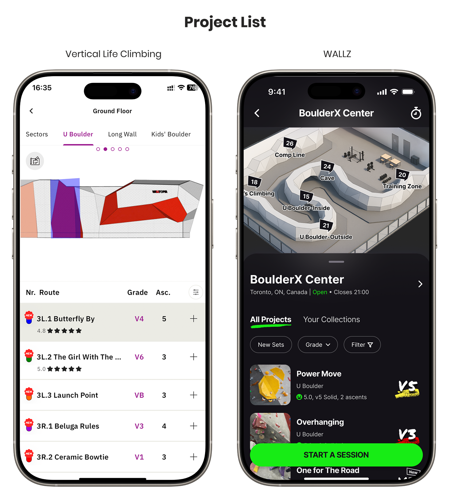
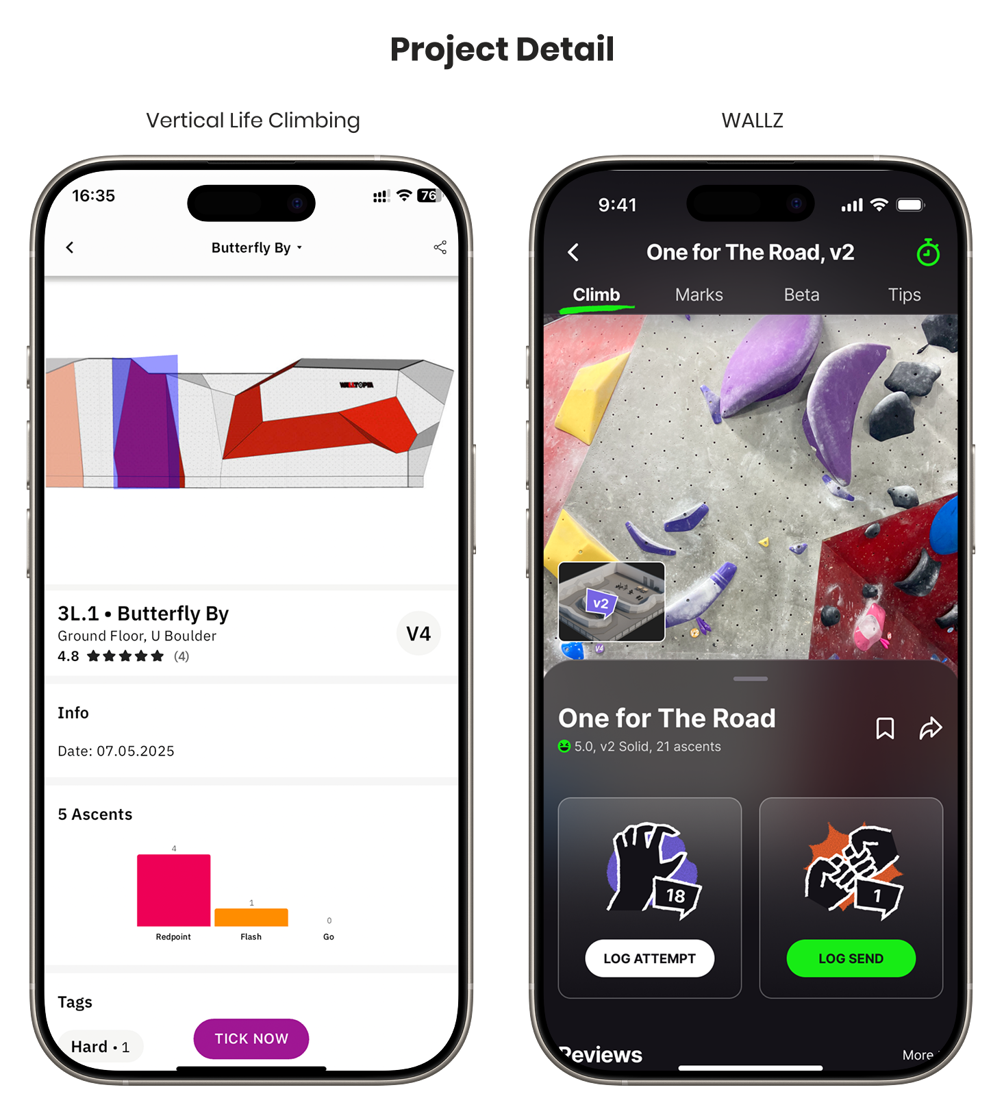
1. Users Track Finished Projects 2x Faster on WALLZ

Users completed the core task of finding and logging a finished project in half the time on WALLZ. This dramatic reduction was a direct result of design decisions aimed at simplifying the user flow and providing a clearer path to action.

A comparison table contrasting the performance of "Vertical Life Climbing" and "WALLZ". The "Average Time" for a task is "2 min 18 sec" for Vertical Life Climbing and "56 sec" for WALLZ. The number of "Steps" required is "7 steps, unclear wall reference, cluttered Log Send form" for Vertical Life Climbing, versus "4 steps, mapped wall interface, clear input fields" for WALLZ.
A side-by-side comparison of the 'Project List' screen in two climbing apps. The "Vertical Life Climbing" screen on the left uses a light theme and shows a text-based list of climbing routes within different gym sectors. The "WALLZ" screen on the right uses a dark theme and features a 3D map of the gym at the top, with a more visual list of projects below that includes image thumbnails and a large "Start a Session" button.
A side-by-side comparison of the 'Project Detail' screen in two climbing apps. The "Vertical Life Climbing" screen on the left displays a 3D model of a climbing route with statistical details below it. The "WALLZ" screen on the right displays a photograph of the actual route, with prominent buttons to "Log Attempt" and "Log Send," and tabs for accessing marks, beta, and tips.
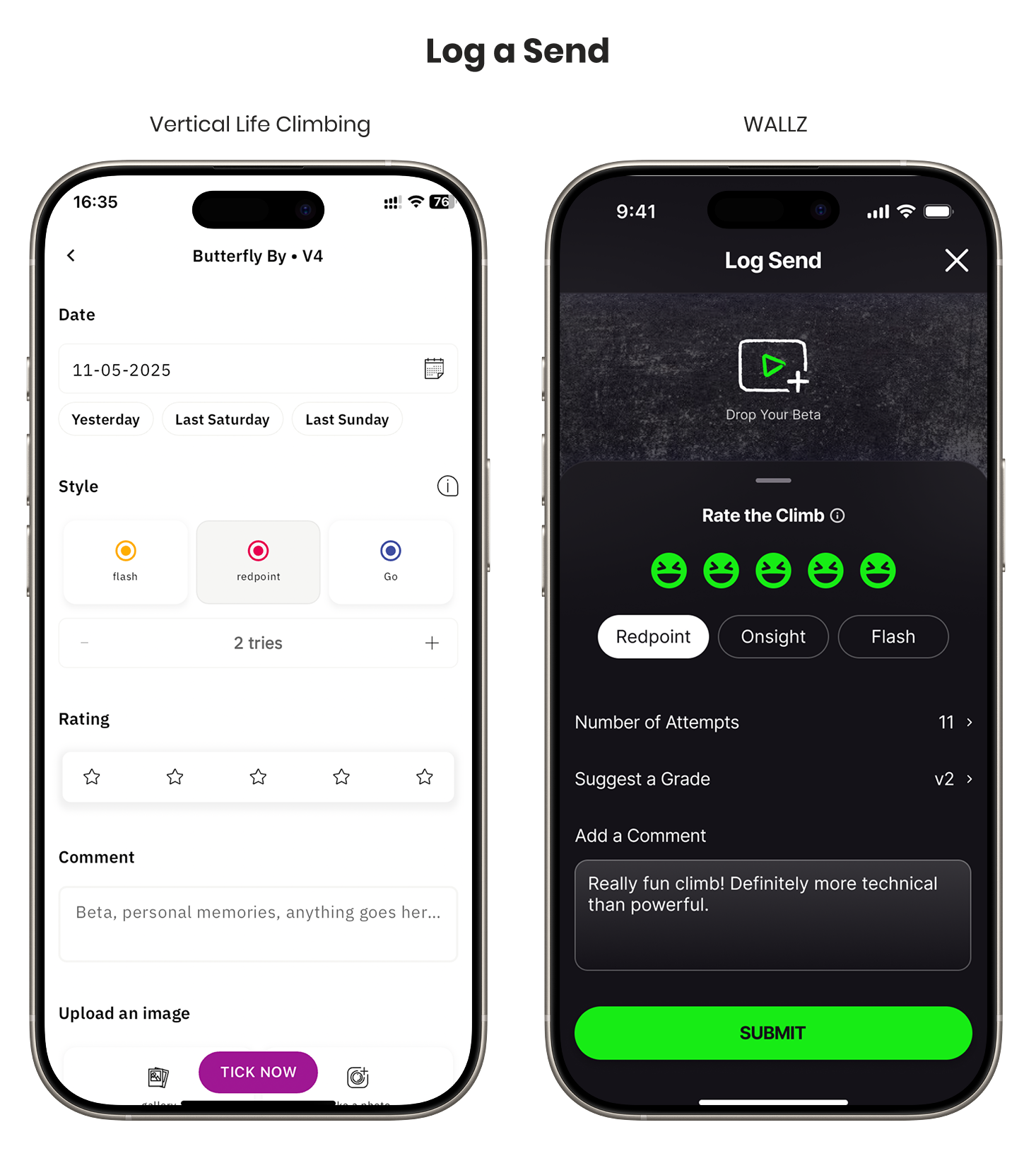
A side-by-side comparison of the 'Log a Send' feature in two climbing apps. The "Vertical Life Climbing" screen on the left has a light theme with fields for date, style, star rating, and comments. The "WALLZ" screen on the right has a dark theme, allowing users to upload a beta video, rate the climb with smiley faces, and enter the number of attempts and a suggested grade.

2. Personalized Beta Support Increased User Confidence

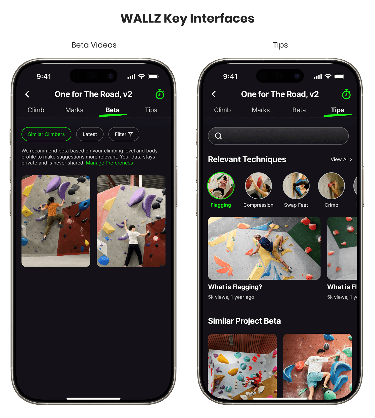
This personalized support was a key factor in building user confidence. During testing, all 4 climbers responded positively to the ability to:

  • Watch beta videos from climbers with similar body types and skill levels

  • Access contextual climbing tips for each project

A comparison table contrasting the features of "Vertical Life Climbing" and "WALLZ". For "Beta Video Access," the feature is "Not included" in Vertical Life Climbing, while WALLZ provides a "Personalized beta feed based on profile". For "Learning Support," the feature is "Not included" in Vertical Life Climbing, while WALLZ offers "Climbing tips tailored to project & user"
A showcase of two screens from the WALLZ app, titled "WALLZ Key Interfaces". The screen on the left, under the "Beta Videos" tab, displays a feed of user-submitted videos for a climbing route. The screen on the right, under the "Tips" tab, provides educational content by showing relevant climbing techniques like flagging and compression, with links to instructional articles and videos.

3. Collaborative Crux-Marking Enhanced Social Connection and Support

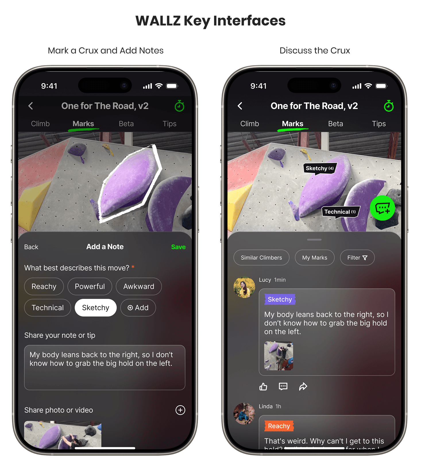
3 climbers shared that they would love to use this feature to exchange thoughts on climbs, noting it made them feel understood and supported.
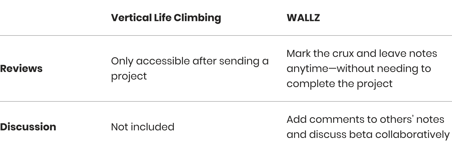
A comparison table contrasting the features of "Vertical Life Climbing" and "WALLZ". Under the "Reviews" category, Vertical Life Climbing's is "Only accessible after sending a project," while WALLZ allows users to "Mark the crux and leave notes anytime—without needing to complete the project". Under "Discussion," the feature is "Not included" in Vertical Life Climbing, but in WALLZ, users can "Add comments to others' notes and discuss beta collaboratively"
A showcase of collaborative features in the WALLZ app, titled "WALLZ Key Interfaces". The screen on the left, "Mark a Crux and Add Notes," shows a user has circled a hold on a route photo and added a descriptive note. The screen on the right, "Discuss the Crux," shows that note posted publicly, with other users able to view it and reply in a comment thread.

The study proved that by streamlining the user experience and introducing key community-focused features, WALLZ made the user journey more efficient and engaging.

Learnings

I’m beyond happy to have combined my passion and profession in such a fun 5-week project. The deeper I explored the research and design process, the more I realized how much UX design and bouldering have in common. Both are about solving problems, testing ideas, improving step by step, and growing through the process.
Progress is always the goal, and new challenges will continue to appear. What truly matters is how I face them—with courage, an open mind, patience, strategy, and collaboration.
Huge thanks to all the peers who shared valuable insights and feedback along the way. I believe this project has great potential, and I’m excited to continue refining it in the future.

Resources

The climbing project photo shown on the Marks page was taken at Boulderz Climbing Centre, Etobicoke.
All other photo in the app mockup are sourced from Unsplash or generated with ChatGPT.

Other Projects

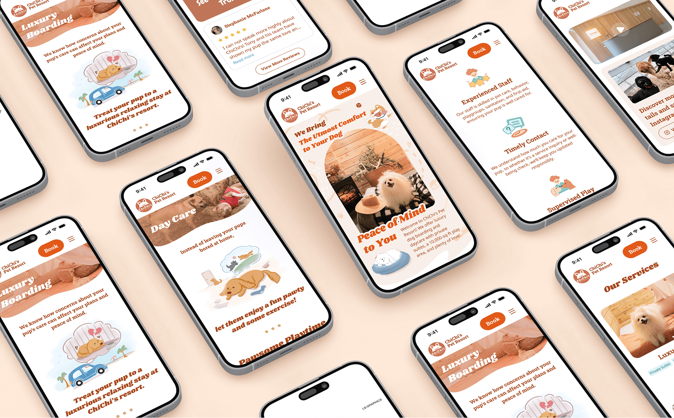
Multiple mobile screens displaying the ChiChi's Pet Resort website redesign. Various pages are shown, including Luxury Boarding, Day Care, the homepage, and sections highlighting experienced staff, timely contact, supervised play, and other services, all featuring dog-friendly imagery.

ChiChi's Pet Resort Website

Elevating a luxury pet resort's digital presence to build trust and simplify service exploration.

Learn More

A dynamic collage of multiple mobile screens from the "Where to Study" app, showcasing various pages of the redesigned educational platform. Screens include the policy encyclopedia, homepage, and different informational sections, all featuring content in Chinese.

Shang Na Xue App

An education information app empowers parents in Shanghai to navigate complex school admissions.

Learn More